Animation Bump, as the name implies, is when the animation quality of a work (usually a television or web series) suddenly improves for a certain scene or sequence. This usually manifests itself in the character animation, with body language and movement being more precise and fluid, and facial expressions being more stuble or detailed. However, it can also extend to other parts of the production: more detailed backgrounds, improved colorwork, more impressive dynamic effects such as fire and water, integration of CGI, etc. In the anime industry, this is called sakuga.
Creators usually put it into practice for pivotal episodes or sequences. This generally means season openers, season finales, and any cinematic moments or action scenes. You may also sometimes find that the pilot episode may have better animation as well, though this is due to it being treated more as a short film proof-of-concept than a single episode in a bigger production, though there are plenty of cases of cheaply-made pilots for that same exact reason. You can also expect any films based on the series to get the treatment, as those usually come with a slight budget increase as well (especially if the company decides the film is theater-bound). Also, the title sequence: it's the first thing the viewer will see, so you really want it to look as good as possible.
Why doesn't the show always look this good, you ask? At the end of the day, animation, even if you're doing Limited Animation, costs hundreds of thousands of dollars to producenote . Unless you're a big name whom executives unquestionally trust with a blank check, you have a budget the studio is holding you to, and thus need to plan out how those funds are going to be allocated smartly: i.e., what gives everyone and everything (the current audience, a new audience, the narrative itself) the most payoff.
Note: This is not meant to say that the rest of the animation for the works listed here is usually bad or inadequate, but only that there are moments that clearly had more attention and money fueled into them than others. Also, shows which have the animation split between several different companies depending on the episode can also fall into this simply because some animation houses have better staff than others; many cartoons made for syndication during the 80s and 90s, especially those produced by Disney and Warner Bros. during the 1980s an, are a prime example of this, with syndications.
This is the inverse of Off-Model, in which animation or art instead become worse than it usually is for a moment or even a whole episode. Compare Art Evolution where, at some point, the art or animation is permanently upgraded. See also Art Shift for when the whole style of the medium deliberately shifts during the course of the work, usually for dramatic or comedic effect. If the show sees a long-term change in animation quality beyond a handful of scenes, it's an Animation Evolution.
If possible, make sure to credit the animators responsible for the remarkable entry. If you need help, Sakugabooru![]() is a good place to start looking. Keep in mind many animated sequences are not credited, and animators have to confirm which sequences they worked for.
is a good place to start looking. Keep in mind many animated sequences are not credited, and animators have to confirm which sequences they worked for.
Compare Action-Hogging Opening, Detail-Hogging Cover. For studios that often get this result, see AIC, Kyoto Animation, TMS Entertainment, Production I.G, Startoons, Carbunkle Cartoons, Toon City, Rough Draft Studios, Digital eMation, Sunrise (at their best), Studio BONES, Moi Animation, Spectrum Animation (which was actually bankrupted because of how much attention they paid to their animation), JM Animation (who said staff later left the studio to find Studio Mir), WIT Studio, and Madhouse. And, of course, Disney.
Examples:
By studio:
- Studio comparison: compare any of Studio Pierrot's animations to The Twelve Kingdoms. Any. It's visible that they tried to apply as much detail as they could, and not spoil the whole animation, as its Off-Model frames are practically non-existent.
- Anime produced by Studio Shaft frequently have this, in particular with its eyecatches. Opening and ending themes are purely artistic and usually have nothing to do with the plot. Some scenes are animated to imitate reference shows. Studio Shaft often inserts real life photographs as objects (ie. ramen cup, onigiri) or inserted with no particular purpose (eg. the head of the manga artist's assistant that frequently appears in Sayonara, Zetsubou-Sensei)
- Any sequence in the Toei Animation films from the late 1960's to early 1970's that were animated by Hayao Miyazaki, one notable instance is the chase scene between Ali Baba and the goofy pink genie in "Ali Baba and the Forty Thieves (1971)'' which otherwise had very simplistic and cartoony animation.
By work:
- Though Attack on Titan has pretty great animation in general, certain action scenes involving 3D Maneuver Gear and other bits are given amazing, and sometimes very realistic animation and detail.
- Berserk (1997) is pretty static early on, with only occasional animation bumps to add emphasis to Guts' feats of arms. Episode 17 has a small bump in line art quality, but is held back by flat coloring until Episode 18 comes around and brings with it a massive leap in quality, suitable for the incredible importance of that episode's developments. The remainder of the episodes don't quite approach 18 and can be pretty uneven, but all are still significantly better done than the early episodes.
- The second season of Black Butler has noticeably higher quality animation than the first. This is most likely because the second season was made two years later (at which point the technology was better) and because it's only half the length of the first season, meaning they could put more money into the individual episodes.
- Black Clover is perhaps the most jarring example of any modern anime. The show is frequently criticized for its mediocre to non-existent animation in most episodes. But then every dozen episodes or so, an episode featuring a major climatic fight will occur and animation quality will skyrocket to a level many anime films struggle to reach.
- This happens in Bleach as well. One of the most impressive examples being episode 219, which was Hisagi's battle against Findor, one of Barragan's Fraccion. The whole episode was animated beautifully.
- Played most straight with the pilot episode and few other early episodes that seem to have considerably more detailed backgrounds and smoother animation than others. Later animaton bumbs tended to happen in most anticipated combat scenes (Grand Fisher, Renji and the fights on Sokyoku Hill).
- Also noticeable in the latter half of episode 226, where Ichigo is struggling against Ulquiorra.
- One scene in this fight is actually traced from the previously mentioned Hisagi vs Findor episode.
- Episode 319. The overall details of things such as lighting and coloring are much greater and more vibrant than a lot of the animation in the series, a lot of the angles used are more dramatic, and even when they decided to resort to pans of still images instead of actual animation they are very well done. What stands out most, though, is that, although this particular episode is part of a Filler Arc, it could be said that the fights scenes depicted in it (i.e. Ichigo's fight with Kageroza) are more detailed and fluidly animated than a lot of fights in the actual canon parts of the series.
- Episode 342 was pure Rukia porn. Her character in several scenes is drawn even better than movie quality.
- This happens between movies as well - each subsequent Bleach movie is better animated and more detailed than the last. Hell Verse was also one of the most anticipated parts of the series' mythology, possibly contributing to a better budget.
- After ten years, the Thousand Year Blood War arc is finally being animated. From the trailers alone, you might think it's being made into a movie.
- Parodied in the first Tiger Dojo segment on Carnival Phantasm, as Taiga notices her segment is finally animated. She wastes a large chunk of the animation budget on a few awesome poses, and appears as a line drawing in the next episode because of this.
- The second season of Cat's Eye has much better animation than the first, accompanied by a change in character designs that while less detailed, worked better for animation.
- CLANNAD's Illusionary World sequences are redrawn every frame, leading to hand-animation so uncharacteristically fluid it almost seems like something else.
- Cowboy Bebop was always a very well-animated series, but "Pierrot le Fou" has much more fluid and complex animation, most noticeable in the CGI beginning and the fight scenes between Pierrot and Spike. Cowboy Bebop: Knockin' on Heaven's Door also has very fluid animation, with the train scene being particularly famous.
- Not that Death Note wasn't gorgeously animated throughout, but episodes 1, 2, 24, 25, 36 and 37 still got a whole lot of attention by comparison. Episode 25 took it to another level of gratuitousness, with details such as Light's face being half-refracted through a glass table for no reason.
- Digimon Adventure episode 21 was directed by Mamoru Hosoda, who made the first two Digimon films. The quality of the artwork was considered by many to be a huge improvement, but Hosoda only directed one episode due to creative differences between his style and the style of the series as a whole.
- While it had some Off-Model days, there are four or five episodes of Digimon Data Squad where the art and animation is stunningly gorgeous. Everyone had fluffier hair, brighter colors and, if you were female, tighter clothes and bigger boobs. Digimon Adventure 02 also had several episodes that were noticeably better animation quality, also mostly centered around fluffier, more detailed hair and more expressive eyes. This was an especially good thing for Kid Samurai Cody. On bad animation days, his bowl cut looked like someone stretched a bit of pantyhose over his head and he frowned a lot. On good animation days, his hair might actually, y'know, MOVE and he can be seen grinning maniacally as he whacks around a Roachmon with a giant teaspoon.
- The first season had a very standard (and unimpressive, to be fair) animation over the episodes... but does anyone remember episode 21 ("Home Away from Home")? It had a huge animation bump, with all the characters looking much more realistic (in a certain form), with more detailed backgrounds and much, much more movement. That happened because that episode (and only that episode) was directed by Mamoru Hosoda, who also directed the first two movies of the anime (and The Girl Who Leapt Through Time). Since the episode was pretty much a Shout-Out (and Continuity Nod) to the first movie, they wanted to have the same art style and, even with a smaller budget, Hosoda did an amazing job with it.
- Dragon Ball:
- Dragon Ball Z Kai is rather stunning in that the animation is virtually identical to Dragon Ball Z (which, for an anime from the late 80s that ran for nearly 300 episodes, was high-quality and had mostly consistent animation from episode to episode), but includes just enough bumps and digital cleanups in that the viewer gets a wonderfully animated trip down memory lane that is sleeker and more fluid, especially during the fighting sequences. The only thing that has truly changed is the opening sequence, which is crisper and more modern.
- In addition, certain episodes of Dragon Ball Z were supervised by top-notch animation supervisors, which made the battles look AMAZING. It was always a thrill watching episodes supervised by Naoki Tate
 , Kazuya Hisada, and Mashiro Shimanuki, just to name a few. Kanzenshuu.com has an impressive animation styles guide that highlight these excellent supervisors... and some that aren't so great.
- Averted in several episodes, such as the battle between Goku and Ginyu, where it becomes Off-Model. Son Goku versus Captain Ginyu took place during a transitional period. Episode #68 was Shimanuki Masahiro's first episode as animation supervisor. Tate Naoki was promoted to key animator with this episode and in general there is a feeling that Shimanuki was still adjusting to his new role. Take'uchi Tomekichi, the animation supervisor of all Seigasha episodes up to this point and the studio's founder, is credited at the top of the key animator list, indicating he still contributed the most key animation drawings. Hisada Kazuya focused on action cuts during this period, noteably Ginyuu's flashy, Kanada Yoshinari-inspired arrival on the scene. Episode #69 was shipped out to Shindou Pro, another regular studio for the series. Shindou Mitsuo's animation corrections tended to give characters sharper looks. Yamamuro Tadayoshi would take over supervising duties beginning with episode #122, substantially improving the love of Shindou Pro episodes. Yamamuro soon became a Character Designer alongside Nakatsuru Katsuyoshi and has held such a position even on 2013's Battle of Gods. Episode #70 is supervised by series character designer Maeda Minoru, thus providing very on-model characters.
- Animation bumps are especially prevalient in the episodes done by Keisuke Masunaga and his team at Studio Cockpit, due in no small part to him and Masaaki Iwane being responsible for some of the show's most notable sequences during the Cell and Buu sagas.
- In a making-of episode of Dragon Ball Z Abridged, it's revealed that Team Four Star were doing their own animation bumps, not just to highten the comedy, but to make fight scenes run smoother and to fix animation errors in the source material; they were also doing color correction.
- Dragon Ball Super although suffering from a strained schedule, can shift animators around to make sure climactic episodes will have more time and talented animators put into them. Episode 66, the final battle of the Future Trunks arc features nearly all Super's regulars and most notably Naotoshi Shida, delivering an even lenthier scene than he did in episode 57. Similarly, as the series directors have said in an interview, such a maneouver was performed for 109-110 two episode special. In the first half it featured a very unexpected appearance of Ryo Onishi, someone who hasn't contributed in any way to the series since Battle of Gods arc and a small bit of opening of Ressurrection F arc, now animating a lengthy and beautiful fight scene between Goku and Ribrianne. In the second half, the first appearance of Ultra Instinct is given just about as much spotlight as it was humanly possible, opening up with a wonderfully fluid scene from Naoki Tate, later including an amazing rotation of Goku and Jiren facing off by Yuya Takahashi and ending with a a very fierce punch by Naotoshi Shida, though his work here didn't include much in terms of movement. Nothing however could prepare fans for the glory that was episode 130, filled to brim with great animators, with the likes of Tate, Higashide, Kenji Miuma, Atsushi Nikaido delivering spectacular scenes, topped off with yet another scene from Naotoshi Shida, far surpassing all of his previous contributions to the series. It was without a doubt the best animated anime episode in the history of Dragon Ball franchise.
- Or it was so without a doubt until the next episode, 131. Although it's short, the climatic final battle between U7's Goku, Frieza and 17 vs. U11's Jiren is gorgeous both in art and animation. Featuring incredibly fluid animation, a strong sense of weight and desperation behind every movement and blow, the final fight is near if not cinematic quality.
- The final fight in Elemental Gelade is drawn far, far more meticulously than the series had been up to that point. To put it simply, the rest of the series is generic shounen, but that last scene has animation quality to match Fullmetal Alchemist: Brotherhood.
- Fairy Tail episode 26, during the fight against Jose, and Gajeel torturing Lucy, were given top-notch animation.
- Natsu and Gajeel vs Laxus near the end of the Battle of Fairy Tail arc was perhaps THE best animated fight throughout the entire anime series at the time. The reason being that this fight was to be the very last serious fight of the anime before ending its 48-episode run having the anime go out with a bang. Obviously, the producers decided to go beyond it at some point in development, and a major drop in animation quality showed throughout the series afterwards.
- Erza and Jellal's scene in the latter half of episode 154 is one of the most gorgeously animated moments in the series. The rest of the episode was fairly average.
- The 2006 Fate/stay night anime by Studio DEEN received quite a bump in quality for its final two episodes. Compare the fluidity of Saber's fight against Gilgamesh to the fights against Rider or Berserker, as well as the detail and intensity of her facial expressions.
- The animation quality of Final Fantasy: Unlimited varied heavily based on which animation group was handling each episode. Some of the best-handled were episodes one, three, nine, thirteen, and eighteen, but special mention goes to the final episode, every frame of which looked like it could serve as one of the most beautiful pieces of the series' lush promotional artwork.
- Happens in both adaptations of Fullmetal Alchemist. Fullmetal Alchemist: Brotherhood has excellent animation as one of its trademarks, but generally the fight scenes, openings, and endings were more fluid and of higher quality line art than usual, especially towards the end of the show. In Fullmetal Alchemist (2003), although it is considered to have quality animation as well, the scenes during the final confrontation are noticeably more detailed, as well as the Ed vs. Greed fight.
- Gintama has the impressively animated fight scenes like the Benizakura storyline, or very stylish ones like Gintoki vs. Jiraia. The same show also has long sequences where all the viewer sees is a still shot of the outside of Yorozuya-Ginchan while the characters talk.
- Talk about how cheap it is to use a still frame like that, even.
- And then, there's one entire chapter when they reused intact pieces of animation from past chapters, pasted them together and put on the character's voices commenting the hoax and even dubbing the other's part... Anyway, it was funny as hell.
- While it's never been much of an animation marvel, Hetalia: Axis Powers had some very impressive scenes scattered throughout The Movie, some highlights being the ridiculously shiny and colorful effect the Picto create and the various militaries of different countries in action, especially the American air force sequence.
- Every single animated version of Higurashi: When They Cry gets a bump from the last. The transition between the first and second season is very noticeable, but between the second season and the Rei OVA can be jarring as well, and so is the bump between Rei and Kira. The bumps are especially noticeable if you're watching them all straight through.
- Episode 7 of Honey and Clover received a textbook animation bump, the characters in this episode, unlike others, rarely simply stand around, there's even a shot of Hagu's eyes welling up with tears which shows spots of her eyes shimmering in greater than usual detail.
- The Idolmaster: The majority of the dance numbers flow quite nicely. Especially in Episode 13 and 25.
- In the Infinite Stratos anime, the titular Powered Armor are noticeably more fluid than everything else, leading to gorgeous fight scenes.
- All of the Inuyasha movies have considerably better animation than the rest of the series, which causes the characters to be drawn in extreme amounts of detail... but the shift is so extreme and so far removed from Takahashi's art style that the characters just end up looking Off-Model instead.
- The Dancing Theme ending from episode 3 of Kaguya-sama: Love Is War has incredibly fluid Rotoscoped animation, to the point that many people initially confused it for being CGI. It helps that the person who animated it was a former Kyoto Animation staffer.
- Kill la Kill is produced by the same guys who did Tengen Toppa Gurren Lagann, which shows in their animation philosophy being exaggerated even further thanks to their current smaller budget to the point it's practically an art form. At points the characters will literally just be animated by swiveling their limbs or bobbing their frames like paper dolls, just so the animators can save their money for the fight scenes that last two thirds of an episode.
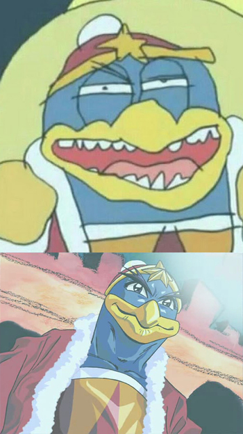
- Kirby: Right Back at Ya!:
- Parodied in one episode when Dedede gets his kingdom to make an anime for him. Since the citizens don't have any experience in animation, the whole thing looks uneven and amateurish, but during one scene with Dedede and Escargoon, the animation shifts to a very realistic, Death Note-esque style that has them drawn in full, realistic detail.
- Generally played straight in the series itself, however, particularly during the Monster of the Week fights, which tend to have much smoother animation than the relatively low-stakes Slice of Life plots. The show is fond of blending cel-shaded 3D models into the 2D animation to save time and money. Dedede and Escargoon in particular switch endlessly between cel to CGI from shot to shot, while Kirby is near perpetually CGI animated. Near the end of the series, Dedede and Escargoon are more consistently drawn in cel animation and only show up in 3D during reused footage, making this an example as well.
- Knight Hunters has drastically varying animation, sometimes within the very same episode.
- Love Hina had about three or four episodes in which characters sang. In episode 11, where Naru became a pop idol, it looked fluid and believable. The other times? Not so much.
- The Lupin III animated series has been around a long time, but most of the animation has remained in one place: TMS Entertainment. However, the wide range of directors and designers who have handled the series over the years have meant drastic changes in animation, from the Ghibli-esque (The Castle of Cagliostro and a few second series episodes) to cartoony and goofy (Legend of the Gold of Babylon) to downright crude (some episodes of the second and third series). Lampshaded beautifully in the anniversary OVA Green vs. Red which had hundred of Lupins, drawn in dozens of varying styles.
- Macross:
- The beginning and ending of Macross Frontier are of a different standard than the middle, which is wildly variable, only meeting the standard of the rest of the series for the action scenes.
- Super Dimension Fortress Macross itself was all over the map, depending on which of the five different studios was in charge of a particular episode. Studio Nue, Artmic, Artland and Studio Gainaxnote turned out relatively stunning (given the budget) animation, but then their episodes would routinely be bookended by episodes from Tatsunoko Production feeder animation studios Star Pro and AnimeFriend (known in Macross fandom as "Star Poo" and "AnimeFiend" respectively), which were apparently chosen mostly because they were inexpensive. And. It. Showed.
- Macross Plus is this for the entire franchise. From the SHADING to perfectly on-model character animation to strategic and smart uses of CGI, Plus is to this day held in high regard as the standard all mecha anime should strive for.
- In one bizarre scene in Magical Girl Lyrical Nanoha, the animation suddenly got much more detailed and fluid. The scene wasn't particularly important; it was just Nanoha and her family having dinner. The jump was so extreme that the whole scene looked Off-Model, despite being better in quality. It's quite telling that The Movie, despite having much higher animation quality overall, actually reduced the framerate and detail for this particular scene.
- The animation quality of Muv-Luv Alternative: Total Eclipse is widely variable, often going from mediocre to excellent not from episode to episode or even scene to scene, but shot to shot.
- The first episode of Naruto Shippuden begins with a Flash Forward to Sasuke's first post-Time Skip appearance that's animated with the kind of detail and care not usually seen outside of movies. The rest of the episode uses more standard TV animation, and, in fact, when this scene is recreated in a later episode, it uses notably lower quality animation.
- Additionally, both Shippuden and the original Naruto have a handful of episodes with much, much more fluid animation than normal, usually during major battles. Some examples include Rock Lee vs. Gaara, Naruto vs. Sasuke, typically once per Akatsuki battle, and Obito vs Kakashi. This is generally the work of a specific team which is very skilled at fast-paced action sequences and not much else.
- Shippuden episode 167 takes this to the extreme, where sequences animated by Norio Matsumoto and Shingo Yamashita use extremely fast-paced, fluid animation with equally loose physics and facial anatomy.
- Episode 375, with its incredibly-animated Obito vs Kakashi fight, is one of the largest disparities of inter-episode animation quality. Obito's absorption of the Juubi is animated with similar quality to the fight, yet the subsequent episode plays the same scene through (from a different view) with the commonly-used sub-par budget animation.
- Additionally, both Shippuden and the original Naruto have a handful of episodes with much, much more fluid animation than normal, usually during major battles. Some examples include Rock Lee vs. Gaara, Naruto vs. Sasuke, typically once per Akatsuki battle, and Obito vs Kakashi. This is generally the work of a specific team which is very skilled at fast-paced action sequences and not much else.
- Neon Genesis Evangelion:
- Especially for the fights involving the actual Eva in both the original series and Rebuild movies. Infamously, all the budget had to be conserved for the fights later in the series, so many of the "character talking" scenes would just be stills or long pans and then suddenly you'd get beautifully rendered Eva fights. On the off chance that you actually saw a character during dialogue, they would almost universally have their back to the audience, be holding something to cover their mouths, or be on-screen for two frames of animation before it cut to a reverse shot of their conversation partner's expression. For better or for worse, this also started a trend in modern anime to "conserve" animation budget by focusing on character interaction, plot exposition, or "art shots". Whether or not they're well done or enjoyable is left to the viewer.
- Episode 17 of NGE features a sudden shift in drawing styles; the characters look like they're all babies. With the notable exception of Misato. Thankfully, by the next episode, everything is back to normal.
- A somewhat similar change also appeared in episode 11. Wherein the characters looked like they came from a Hayao Miyazaki film. Of course, a quick glance does reveal that Studio Ghibli did work on that particular episode.
- One of the final episodes of Ojamajo Doremi had this. Compared to the rest of the episode (and the rest of the show's run), it was very fluid and highly detailed. Bonus points for this same show being notorious for being Off-Model some of the time.
- One Piece seems to be getting this treatment more and more ever since the show first went HD. For certain scenes, such as unimportant or relatively minor fights, you would get standard (and sometimes below-standard) animation, but for other, more important fights, you'd get well-constructed, fluid, almost-movie-quality animation.
- The G8 arc was one of the high points for the early episodes. Particularly episode 199 which was directed and storyboarded by the well-acclaimed Mamoru Hosoda. This may have been a sort of "test run" as he directed the 6th movie and worked along side many other "top tier" artists and animators for this film.
- The middle to end of the Thriller Bark arc signaled this very well as it was the first time that the One Piece TV anime received such a high number of great animators to do it justice.
- The Sabaody Archipelago arc can be considered the best animated story arc so far. The art consistency did drop a lot, but there was hardly an episode with poor animation during this 21-episode arc. Many of the episodes (including those headed by the well known "average" animation directors) got treated with lots of fluid, "expressive", and just generally better animation in comparison to the norm.
- An odd example of this is how the art and animation of the average episode went up during the post-war arc. Although the "war of the best" had a lot of short but sweet animation, the average episodes fell short of the post-war arc's in terms of the art and animation (this was despite the fact that the post-war arc hardly had any "great" animation).
- Sadly, we have the highly erratic animation of the New World Saga. The animation changes quite often throughout the episodes of the Return to Sabody and the Fishmen Island Arcs. The animation always seems to be either ridiculously top notch and smooth, poor, or very poor, depending on the situation. For example, all of Luffy's fights in the Fishmen Island arc were given the best of the best animation; particularly impressive was Luffy's kick against Hody, Gum Gum Red Hawk, and Elephant Gatling. But, the animation of the crew's fights were noticeably sub-par, using many sudden still shots and slow, almost frame-by-frame animation. And by far the worst animation was during the flashback arc; the frames were practically crawling in the Jinbe vs. Arlong fight along with unusually cartoonish yellow "pow stickers" whenever Jinbe punched Arlong.
- Starting with the Wano Arc, however, a HUGE bump in overall quality and consistency occured and the episodes are all given polish. Some episodes in particular, directed by Megumi Ishitani and animated by a crew of different animators, are given extra effort and look nothing short of incredible.
- Episode 21 of Outlaw Star has a noticeably more fluid animation than any of the previous episodes.
- Panty & Stocking with Garterbelt's episodes seemed like they were each animated by a different studio. Some episodes, like "The Stripping", had consistent, on-model animation whereas others, like the OVA, had extremely cartoony, off-model and lazy animation.
- In Penguindrum, episodes 9 and 20 are beautifully animated. It's also worth nothicing that both are centered on the same character: Himari Takakura.
- Episode 1 is gorgeous as well.
- Pokémon: The Series:
- Quite a few instances in this long running series have had this, normally during important battles or when the animators just want to show off. The movies are also noticeably better animated.
- This especially applies to episodes (and two of the movies) animated by Masaaki Iwane. The very first episode he directed the animation on? CHARIZARD VS. MAGMAR.
- However, on average, Akihiro Tamagawa's works are the absolute best. Episodes like Journey to the Unown (the scene of Dawn climbing up the stairs with Piplup and Aipom comes to mind), Bagged Then Tagged (especially Monferno delivering the finishing punch to Croconaw. The episode notably introduced battle animation that was reused later on) and the special Mewtwo Returns are some of the finest in the series. The only downsides are that he's rarely involved in the series and seems to animate less and less episodes as the show progresses.
- It's especially noticeable in Pokémon: Lucario and the Mystery of Mew, where May's death scene (which, of course, turned into a Disney Death later on) was so incredibly well animated, that it actually made her look about 5 years more mature than usual.
- Speaking of Lucario, another one fought under Maylene against Ash's Buizel in A Triple Fighting Chance!. Likely for being the final battle in the match, it received a boost in fluidity as soon as the Gym's roof got destroyed and the rain kicked in. The music used during the scene made it look even more impressive.
- The Ash vs Tucker battle in Tactics Theatrics, which is probably the smoothest-looking fight in the entire series.
- Pokémon the Series: XY: XY's animation is notably different from the previous anime incarnations, and for a good reason; The people who animated Pokémon Origins took over the animation work of the main series anime. This is welcome news to a lot of people.
- The Pokémon the Series: Sun & Moon series takes this a whole other step, along with having several character redesigns, the animation is far more frenetic and expressive than previous series, with the art style being more streamlined or made Off-Model as a necessity to allow a much greater amount of characters and movement per shot.
- Journeys mostly keeps a mildly altered version of the artstyle employed in Sun and Moon to the same result, although certain key scenes are given improved and more defined quality. In particular, the last leg of the Final Battle between Ash and Leon has significantly improved animation, standing out over just about any non-movie project in the franchise.
- Pretty Cure:
- Heart Catch Pretty Cure made use and abuse of this trope, ESPECIALLY during important plot episodes that focus on Ensemble Dark Horse Cure Moonlight and/or Dark Pretty Cure.
- Go! Princess Pretty Cure Although the series is already quite pretty and well-animated most of the time, the animation is of noticeably higher production during the hand-to-hand fight scenes, especially in the more important episodes such as the introduction arc (ep. 1-5), Episode 11, Episode 22, etc.
- Episode 30 in particular has some of the best animation in franchise to date, better than even some of the movies.
- Episode 39, particularly when Haruka has her She's Back moment manages to surpass Episode 30. That really speaks for itself.
- Episode 50, particularly the final fight with Close looks better then any other scene in the whole show.
- Tropical-Rouge! Pretty Cure had a couple of episodes where the animation quality took a significant boost as well, specifically during the Climax Boss fights in Episode 29 and Episode 45.
- A notable example in Reborn! (2004) is episode 123. The fight between Yamamoto and Genkishi had truly impressive animation, especially compared to the so-so quality the series usually has.
- The Record of Lodoss War OVA series is the poster child for this among anime. Most of the series has laughably static "animation" dependent largely on still images, but the first episode would measure up favorably against just about any other direct-to-video series you can name. Likewise, the opening credits of the TV anime series, Chronicles of the Heroic Knight, practically seems to have consumed half the budget considering how much better it looks than the show proper.
- In R.O.D the TV, there is a small number of brief flashbacks to scenes from Read or Die (an OVA). The sudden jump in frames per second and then back down again is very noticeable when it happens (and there are differences in animation style and detail as well).
- Rurouni Kenshin is a relatively well-done series, but one scene in particular benefits from an animation bump: when Kenshin leaves at the end of the first story arc, his farewell with Kaoru is drawn far, far better than anything else in the entire run of the series. The scene is the subject of frequent callbacks afterwards, and any time it's shown, it makes the normal animation look a lot worse than it actually is. The Darker and Edgier Kyoto arc, which is also the series biggest story arc, is also much better animated as a whole than the previous arcs and later anime original arcs. Coincidentally, the Kyoto arc starts after the scene above. The fight between Kenshin and Saito is also much more fluidly animated, as are most fights at the end of the Kyoto arc.
- Sailor Moon had fairly standard, if a bit on the cheap side, animation for its time in the first three series. However there is a definite quality increase for climactic episodes like Sailor Senshi introductions, villain showdowns, big revelations and episodes involving major character death.
- To cite a specific example, you would be hardpressed to find someone who doesn't consider the sequence in episode 125, where Sailor Moon transforms into Super Sailor Moon after the destruction of the Holy Grail, to be absolutely gorgeous, perhaps even the pinnacle of animation of the entire series.
- The animation quality of Saint Seiya Omega usually ranges from Off-Model to Quite Good for a Sunday morning anime aimed at kids, but the episodes directed by Yoshihiko Umakoshi are visually stunning. The first season's finale is particularly notable.
- The animation of Astaroth's music video shown at the end of episodes 5 of Seven Mortal Sins is much more dynamic and fluid than any other scene in the episode.
- Shakugan no Shana: The more serious and depressing first season of the anime is notably better animated than the Love Triangle centered first half of the second season. Except for Kazumi's breasts.
- Sherlock Hound, a Funny Animal detective series, had the distinction of having six early episodes directed by world-famous animator, Hayao Miyazaki. While there are a few tiny clues giving away these episodes (a minor character is colored differently in Miyazaki's version), the most obvious clue is that the main characters become more detailed, and the animation quality shoots up roughly tenfold, into territory usually reserved for movies. Notably, all of the footage from the opening is taken from Miyazaki's episodes.
- Sket Dance had a large animation bump done to its second opening - up to and including episode 18, there was a lack of shading, and many of the character models rather simplistic and disproportional in comparison to the rest of the show's animation. In episode 19, the opening had many revisions, showing obvious signs of improvement (Himeko's swimsuit and hair got some proper shadows, Switch no longer looked like he was surprised while drumming, Bossun's arms were no longer toothpicks, etc.)
- The animation for the Slayers anime is rather standard, if a bit cheap, but the animation for just about any fight involving a lot of magic moves more naturally. This usually occurs during the last several episodes. It's mostly due to a bigger budget and better technology overall, but the animation for the fourth and fifth seasons (which came out 11 years after the third, mind) utilizes smoother movement for characters in action. There's actually a quick, throwaway scene that illustrates this: episode 10 of the fifth season involves Zelgadis slamming a fireball spell into the ground to blindside his allies; the fluidity is in the motion of his arm.
- The earliest episodes of Sonic X were crisper and even referenced Western Animation style frequently with much more "squash and stretch" than conventional anime. The budget seemed to decrease more and more as the series continued.
- Exaggerated in Space Patrol Luluco when Over Justice (who normally only has a single frame of animation) has a Let's Get Dangerous! moment and basically has a frame-for-frame recreation of the Super Tengen Toppa Gurren Lagann.
- Symphogear started its first season with perfectly adequate animation with a few highlight scenes, but the quality of animation improved with each successive season until by the 5th and final season, it was pretty close to movie quality.
- The last few episodes of Tengen Toppa Gurren Lagann's 27-episode run consumed 40% of the animation budget. This caused any discussion on /a/ and /m/ of it during that time to exclaim 40%! And the most fluidly animated scene in the series is a throwaway scene near the end of Episode 13 that's just Yoko and Simon looking at each other. The fluidity of the animation can be seen in their hair blowing in the wind.
- The entire run of Togainu no Chi. The animation is so insanely bad sometimes the main response after the new episodes is "IS THE ANIMATION BETTER YET OR AM I JUST GETTING USED TO IT?" Notable examples include Shiki's coat and any fight scene.
- Toriko has this during the important battles, but episodes 33 and 34 are by far the best animations the series has produced so far.
- Unicron Trilogy:
- In the Transformers: Armada episode "Alliance", Unicron's transformation is done in noticeably higher quality than the entire rest of the episode.
- True to the trope's guidelines, it also happened in the last episode. This is signified by Optimus suddenly gaining some degree of facial expression without relying on the Kubrick Stare, and an extended fistfight with fluid animation and a lack of motion tweening.
- Transformers: Energon: Due to the inability of the Cybertronians being unable to really emote or move properly in CG, the show occasionally switched to traditional 2D animation for them.
- Given a Stealth Lampshade in the final battle between Prime and Galvatron: As their size and power increased, their animation grew less and less technological, going from Cel-shading to traditional CGI, and then to 2-D animation. One theory states that if they got any bigger, they'd turn into pencil tests!
- Transformers: Cybertron: Most of the time, the Transformers are noticeably lacking in the facial animations department and can only really open and close their mouths to express themselves. The episode "Ambush" grants them more defined facial expressions, increases the fluidity of their mouth movements (with one scene having incredibly precise lip-synching), and makes Thunderblast's breasts jiggle when she runs.
- In the Transformers: Armada episode "Alliance", Unicron's transformation is done in noticeably higher quality than the entire rest of the episode.
- The quality of the animation and coloring jumps considerably higher for the final episode of ∀ Gundam.
- The last episode of the Vampire Princess Miyu TV series had higher quality and flashier animation than the rest of the series. Given that the final episode is the final installment of a two part story arc and starts off right in the middle of where things left off last episode this is even more noticeable and jarring than normal.
- Most of the important episodes of Yu-Gi-Oh!/Yu-Gi-Oh! GX/Yu-Gi-Oh! 5Ds are usually done with an art style which is usually quite superior to the rest of the episodes, whilst in some cases the Opening/Closing sequences are often done in a better animation style. Other than the climaxes, the animators go through a regular cycle of episode production—some are good, some bad. In the case of Yu-Gi-Oh 5D's, some of the more important duels will either have one episode of the battle's run with high quality animation, and at the same time the high quality animation episodes seem to be fairly prominent in the last episode of a story arc (Episodes 26 and 64 are good examples)
- Also present in the Pyramid Of Light movie.
- The entire Darkside of Dimensions anniversary movie has probably the most gorgeous animation of any of the original Yu-Gi-Oh! run, which a notable few frames animated by Kazuki Takahashi himself.
- YuYu Hakusho does this sometimes in a similar way to Naruto, which is made by the same studio.
- Feng Ling Yu Xiu: The animation is noticeably smoother in the fourth episode than the third.
- White Cat Legend: The animation maintains a high and consistent quality throughout the first season. Come episode 12, the production value takes a big leap: more fight scenes are added, several scenes blend 2D and 3D animation together, and it's compounded by the average run time of 14-17 minutes for this series's episode being extended to around 25 minutes. The battle between Li Bing and the four-armed demon is a shining example of this in the series (animation by Hun Lin & unknown artist).
- Turnabout Storm's presentation basically amounts to Ace Attorney's trademark Character Portrait style plus voice acting; but unlike that series, the character portraits there are only simpler stills of the characters instead of animated sprites — At least, until they step inside the courtroom. Once there, all dialogue is lip synched, Phoenix Wright gets to show his desk-slamming, finger-pointing abilities, and Wild Takes are shown in all of their glory.
- Suikakasen, as a Film Comic, has very little in the way of actual movement with screen shakes and images sliding across the screen being common and most of the actual animated segments (such as the worms on the rotting apple from Seiga's feast) follow Limited Animation at best. The exception occurs during the final battle when Kasen does an Unnecessary Combat Roll that ends with her preparing a punch and gets Mouth Flaps to go along with her dialogue, all of which is animated frame-by-frame and gets far more movement that anything else in the series.
- The first episode of the Animated Adaptation of Sonic the Hedgehog (IDW), Sonic Rebound, is made of painful Limited Animation. With the notable exception of Sonic running face-forward, there's limited and choppy movement, excessive use of still shots, and lazy lip syncing consisting of mouth flapping. This is justified since it's a No Budget pilot episode. The animation of the second episode is much better, with more fluid movement and actual lipsyncing, giving an animesque vibe. The third episode's animation, while not as bad as the first's, is more limited than second's however.
- Recess: School's Out had much better animation than Recess usually had, though it had a much larger budget and didn't have the deadlines of the TV series, meaning more work could be done on improving the quality.
- The SpongeBob SquarePants Movie had better, smoother, more fluid animation than the series itself. The Sequel The SpongeBob Movie: Sponge Out of Water looks even better due to the improvements in technology, especially when the 2D characters become CGI.
- My Little Pony: The Movie (2017) has vastly more detailed and fluid animation than the series proper, which tends to look nice enough as it is. This is particularly noticeable in the ponies' faces; while the expressions in the show tend to look fairly similar to each other (except where the model is intentionally broken for comic effect) as a result of reused assets, characters in the movie never make the same face twice — Pinkie Pie's expressions have become especially zany and exaggerated. While a natural consequence of the higher budget, it also has to do with the series switching from Adobe Flash to Harmony, and as a result making heavier use of traditional frame-by-frame animation techniques.
- Transformers: The Movie employs shadows, much more carefully drawn character models, and far more fluid character movement that makes the series look downright primitive by comparison. In short, Transformers went from frequently off-model animation to a level that could give even mecha OVA (to this day among the crown jewels of animation) a run for their money.
- The theatrical films based off the Chinese series Happy Heroes amp up the quality of the animation and the shading; in the TV show, the shading is usually kept to a minimum.
- While Hanna Barbera suffered a huge crunch in animation quality when they switched from MGM's theatrical unit to their own television projects, their first theatrical movie, Hey There, It's Yogi Bear!, where they obviously regained a bigger animation budget, demonstrated that their old fluidity hadn't quite left them yet. Some shots are quite reminiscent of their final Tom and Jerry shorts.
- All of DreamWorks Animation's movie version of How to Train Your Dragon is a marvelously-designed CG movie, having some absolutely gorgeous designs for the village of Berk itself, the surrounding forests, oceans, and mountains, wildly varying dragons, and long hair and fur coats that bristled in the wind similarly to Tangled. The last eleven minutes of the movie, however, namely the epic fight to the death with The Red Death is where the already amazing animation takes several leaps and bounds all on its own, to the point that rocks get shattered and flames are shown burning as realistically as possible, with the hair of the stunned Vikings flowing like the actual thing.
- In the Disney Animated Canon, any scene animated by Milt Kahl (one of the Disney's Nine Old Men). Praised as the greatest animator ever lived by another ridiculously skilled animator Richard Williams in this video, his scenes have much more fluid movement and, during Disney's "sketchy" Xerox era, have a recognisable drawing style. Notable examples include Medusa and Snoops in The Rescuers and Shere Khan in The Jungle Book. Here is a large collection of "pencil tests" of scenes animated by him.
- Most of Disneytoon Studios early B Team Sequels were a clear downgrade from the company's mainstream works, with almost television episode level quality and budget. As the studio was reworked and animation transitioned to digital however, a lot of projects became far more polished and better at replicating the original films.
- This is often prominent with works that had two sequels in both earlier and later years. The Lion King II: Simba's Pride and The Little Mermaid II: Return to the Sea for example were relatively crisp for the time they were made, but still rather basic and crude. The Lion King 1 ½ and The Little Mermaid III: Ariel's Beginning on the other hand look almost on par with their series' first films in detail and fluidity.
- Bambi II in particular has rather lavish quality animation due to Disney veteran Andreas Deja supervising the whole thing. While it makes attempts to emulate the first film however, the style is much more akin to Disney's Renaissance-era works that Deja's mainly did work for.
- The Thief and the Cobbler: Zig-Zagged (no pun intended). Richard Williams put incredible effort in the animation. However, due to going over budget and missing deadlines, he was fired from his own film, and cheapskate Fred Calvert was put in his place. Calvert had the remaining animation done overseasnote , resulting in very Off-Model animation. As a result, the animation varies wildly in quality from scene to scene.
- On a related note, Williams himself greatly defines this trope as his drawing and animation skills improved greatly throughout his years as a commercial artist. Compare one of his early films from 1962 to his most recent from 2015 note ... just... wow.
- On a related note, Williams himself greatly defines this trope as his drawing and animation skills improved greatly throughout his years as a commercial artist. Compare one of his early films
- Watership Down goes from a deliberately primitive opening, directly to a conspicuously detailed shot of a butterfly in a meadow, where every blade of grass appears to be rotoscoped. Most of the film is shot in fuzzy watercolors but with much looser animation for the moving characters, and more folk art-style Limited Animation dream sequences, only to transition back to sharp-focus close-ups in key scenes.
- In the animated adaptation of The BFG, different characters were drawn and animated in different ways. The Queen, the Paras and the Royal Guards are drawn in a hyper-realistic, rotoscoped way, while the military commanders, the giants and even Sophie are animated in a more traditionally and cartoonish, but less detailed way. Sometimes, it can be rather jarring to see the Queen's comparatively stale, realistic expressions compete with the tubby, fat-nosed Field Marshall's over-the-top gesticulations, while on other occasions (like the army overpowering the giants), it's rather genius.
- Son of the White Horse has a unique art style as is, but certain sequences are much more fluid, dynamic and feature better detailed characters with livelier animation, while some scenes are simplistic if not outright choppy. This is because most of the animators and cel-painters found it very tough to get a grasp on the film's visual style, and facial animation in particular had to be kept to a minimum. Some scenes were also sloppily redone when poor animation materials ruined the original takes. The more fluid shots, meanwhile, were animated by the director Marcell Jankovics himself, with some of his more talented high-ranking colleagues occasionally helping out.
- The Tragedy of Man, by the same director, is a rather uneven mishmash of fluid animation and one frame per second dissolves, due to most of its ~20 year production time having been spent on raising funds. Often, the animation style and quality changes midway through a shot. Certain scenes, however, stand out not only for their superb details but also their high animation quality with expressive, lively movements.
- Heroic Times was animated via extensively detailed oil paintings, so obviously many corners had to be cut. While most of the movie relies on Limited Animation, Stock Footage or plain still images, shots that required full, fluid movements were laboriously animated.
- In Titanic: The Legend Goes On, the scene where Victoria gives Angelica her dress is probably the only scene in the movie that actually looks like it could be presented in a theater.
- The Twelve Tasks of Asterix has the traditional animation occasionally spiced up with some nice looking Rotoscoping, most notable seen during the dance scenes on the island of pleasure.
- The Chipmunk Adventure has noticeably more fluid and detailed animation than the Alvin the Chipmunks 80s series it spun off from, with the premise having the Chippettes and the Chipmunks venturing through multiple beautiful and unique backgrounds and settings.
- Animated feature Belladonna of Sadness varies wildly between Limited Animation (often no animation at all, just the camera panning and zooming over still drawings), and intricately detailed and fast-moving animation, mostly during the sex scenes that make up a large part of this Erotic Film.
- In the 1994 live-action version of The Flintstones, CGI dinosaurs appear a lot at the beginning and end of the movie. Budget-savingly, these dinosaurs are almost entirely absent from the middle portion of the film, save for a few awkwardly composited puppets.
- While Transformers (2007) and its sequels Revenge of the Fallen and Dark of the Moon have decent effects throughout, there're quite a few times where you can tell that the effects studios spent a lot of time on them (like Optimus' Transformation in the first film and any of Driller's scenes in the third). Driller is such an example that Industrial Light & Magic's entire render farm was used to process his scenes!
- The opening short of Who Framed Roger Rabbit is noteworthy for being animated at a full 24 frames per second, as opposed to the more common 12 frames with each frame repeated twice to make up the 24 frames per second of standard motion picture film, a process known as shooting "on twos". And, partially as a result, it's known as the most expensive animated short of its type ever made, being produced essentially twice over while still using the traditional hand drawn, physical ink-and-paint techniques. The rest of the film, while still mostly animated at 24 fps in order to fit with the live action, doesn't quite maintain that same quality in its animation. Notably, the entire Toontown sequence appears to have been done at the 12 frames per second rate. Which was intentional, as it helps make Toontown not only more accurately resemble the classic cartoons that inspired it, but also to make it look otherworldly. It still looks more than good enough though — in fact, Richard Williams won not only one, but TWO Oscars for his animation direction.
- Doctor Who:
- The official animated reconstructions of Doctor Who's Missing Episodes are made by multiple studios and with multiple head animators. As a result, while Limited Animation is always present, they fluctuate all over the place in quality from "The Reign of Terror" (mostly just lip-synched Talking Heads at extreme close range unless completely unavoidable, even when it's obvious from the sound that the characters are being shot from further away) to "The Moonbase", which contains a lot of hand-drawn movement, beautiful light and shadow, and looks like an anime.
- When watching an animated reconstruction, you can always tell what footage they have that survived because the animation quality significantly improves for that scene due to the use of a reference. For example, the cliffhanger scene at the end of Episode 1 of "The Moonbase" shows Jamie moving in a stiff, simplified way... until it reaches the point where he sits up from the bed, and his motion suddenly becomes much more fluid and expressive. That's because that part of the cliffhanger was repeated at the beginning of Episode 2, which has survived.
- The telesnap-based reconstructions (such as those by Loose Cannon) sometimes have this effect, as quite often some small amounts of footage of missing episodes have been recovered. A notable instance is in one episode of "Galaxy 4", which contains a whole scene of the Doctor and his companions talking to and tussling with the Drahvin, and the rest of the story is all still images, Limited Animation using simple digital cutouts and rolling subtitles. Also, watching a whole serial with some reconstructions and some surviving episodes leads to this effect.
- The Disney Channel series Bunk D is a rare live-action example of this trope in action, specifically of the intro sequence variation: the intro uses very high-quality film techniques, impressive (for a TV show) computer effects and is shot in a single-camera format while the show itself is show in a multi-camera format with the same low-budget considerations as every other Disney Channel series.
- This is often seen when video games do not use the game engine for cutscenes. Notable examples should be listed.
- Even now there's a notorious practice of using the best rendered cutscenes for trailers that look like gameplay. Final Fantasy in particular, from VII onward.
- Harry Potter and the Order of the Phoenix uses both game engine cutscenes and pre-rendered animated cutscenes. It is extremely easy to tell them apart.
- Pre-rendered cutscenes in Jade Empire look significantly blurrier than the game engine cutscenes. The same is true of a lot of older games when played on modern hardware, since newer technology can render gameplay at much higher resolutions, but pre-rendered scenes are generally stuck at the resolution they were originally rendered at.
- Sonic the Hedgehog (2006) is notorious for having having pretty lousy in-game cutscenes—not helped at all by the uncannily "realistic" character designs and poor in-game models —and also having quality CG cutscenes, which most people say is one of the few good things about the game. Seeing the beautifully-animated opening CG intro being followed by the first in-game cutscene is astounding in terms of how far the production values drop.
- Tales of Symphonia uses intricate animation for its intro, and approximately ten seconds of full animation thereafter with mostly static storytelling throughout.
- Ditto Tales of the Abyss (although being a bit more generous in the full animation department), but Abyss has an interesting variation. When cutscenes are used to show characters talking, despite being voiced, they get no real detailing - characters move in prerecorded movements, no camera work, etc. When something actually important is happening, though, Namco starts to use its cutscene engine to the max. Examples include when Sync drops his mask for the first time, when Guy's backstory is shown and before the final battle with Van. Those scenes have quite a lot of detailed movement, and scene angles are played more professionally, in a more dynamic way.
- Team Fortress 2. While the actual game doesn't look bad at all, the "Meet The Team" videos are all gorgeously animated and use separate, more detailed character models with very realistic facial expressions. The best part? A few console commands and the game replaces the standard character models with the high-quality ones and cranks the environmental details up to 13. It's virtually indistinguishable from said promotional videos. Even the shorts themselves went through an Animation Bump over time. The earlier ones like Meet the Heavy and Meet the Engineer have less detailed models, animations, and lighting/shading, while the later ones like Spy, Medic, and Pyro have more detailed models, realistic lighting/shading, and outstanding animations on par with a Pixar or DreamWorks film.
- As of 2012, the program Valve used to create the "Meet The Team" shorts, Source Filmmaker, is now released - for free! - to the public. Meaning, with time, skill and patience, anyone make videos up to their quality with the proper lighting and beyond. Better yet, you can even edit a couple of the Meet The videos yourself.
- Possibly not the perfect example, but both Kingdom Hearts and Kingdom Hearts II give us two kinds of cutscenes: a generic kind, with "pixel mouths" and prerecorded movements; and the detailed kind, with great fluidity, expression and overall quality. Of course, scenes with the latter can be considered Animation Bumps in relation to the scenes with the former. It's particularly noticeable since they are used interchangeably in the same scene, so it's easy to spot when the cutscene quality suddenly drops/increases. It's especially jarring during the final cutscene in Kingdom Hearts II where the quality shifts mid-cutscene from the usual higher quality cutscene mentioned above to beautiful CGI animation reminiscent of Advent Children.
- This is VERY noticeable in Final Fantasy X. The CGI cutscenes approach photo realistic, making the transition between cutscene and in game graphics somewhat jarring. Square attempted to avert this by using character models with high-poly facesnote during scenes with close ups that used the in game engine, but it did not help much.
- This was even worse in Final Fantasy VIII on the PS1.
- The .hack// games used seperate models for animated cinematics from those used in gameplay that were higher-quality and animated more smoothly. The .hack//GU games used the same trick as Final Fantasy X for its in-engine cutscenes, using higher-quality models for close-ups, as well as featuring pre-rendered cinematics that put the in-engine graphics to shame.
- Bully: Pre-mission cutscenes are more fluid than the rest of the game, while mid-mission cutscenes are run on the usual game engine.
- Metroid: Other M was touted in previews for its cinematic, CGI cutscenes. The side effect was that it didn't gel with the rest of the game, which seemed to be going for a "Realistic" style on the Wii (which most devs know that it won't really work on the system), but had several strange graphical decisions (such as JPEG stalactites), like it almost seems to be trying to make up for the disk space taken up by the CG cutscenes. Probably the best display of this, however, is in the unlockable Theater Mode, which strings together those CG cutscenes, the in-engine cutscenes, and game footage together in a movie. The results are quite jarring.
- Inverted in the older game Freedom Force — those cutscenes NOT done in the engine, usually character origin scenes, are LESS fluidly animated — justified, as they are more in the style of a motion comic book, rather than actual pre-rendered cutscenes.
- Rayman Origins is an animation bump for the entire series. Fluid movement, Deranged Animation, fantastic lighting and beautifully animated characters, Rayman himself is no exception. And the best part: everything was painted by hand.
- The sequel, Rayman Legends, uses a more oily style of painting; making it look more 3D and better than Rayman Origins.
- An interesting and justified example was found in the Nintendo 64 port of Resident Evil 2. Due to hardware limitations, as more sprites appear on the screen the resolution drops to keep the game running at full speed. Because of this you'll often see abrupt changes in the animation quality, especially when ambushed by a large enemy or a flock of crows.
- While The Wonderful 101 has excellent visuals throughout, the cutscenes that don't involve Talking Heads look absolutely outstanding, and could even be mistaken for a scene from a CGI movie.
- Cel Damage had some pretty sloppy-looking walk cycles. Not so much in cutscenes, but definitely in-game, as most characters who are left running around after their vehicle is blown up would look more like they were sliding or skating. However, in the cancelled sequel, from the 15 seconds of early alpha footage we were given and the one second we were given of walking/running, the walk cycles look like they had improved drastically. Just look at how Violet runs.
- In Yu-Gi-Oh! Duel Links, signature monsters, such as Yami Yugi's Dark Magician, get special summoning animations.
- The opening cinematic of The Original Strife: The Veteran Edition is of vastly better quality (ray-traced graphics etc.) than the game itself. The Strife episode of Ross's Game Dungeon lampshades this.
- The Binding of Isaac:
- Afterbirth bumps up the animation for the final boss of Greed Mode, Ultra Greed. Compared to the other enemies and bosses, his movement is more detailed, smooth, and slower.
- All of the new bosses in Repentance have significantly more fluid and detailed animation compared to their predecessors, but the True Final Bosses Dogma, the Ultra Harbingers, and The Beast deserve special mention.
- A very significant example in Fate/Grand Order, not just for visual reasons, but also gameplay reasons. At the game's (very rocky) release, most Servants shared the same attack animations, with very few exceptions. This also mattered because hit counts (which matters for Critical Hits and Noble Phantasms) were tied to the animations. Servants released after the launch were given more unique animations for their attacks (with more variable hit counts) and more elaborate Noble Phantasms, which were not only visually stunning, but also more reflective of their individual fighting styles (ex. Flash Step master Okita incorporates tons of them in her attacks, while Mordred fights more similarly to traditional Sabers, but is notably less refined than her "father"). As part of Growing the Beard, most Servants were given updated sprites and animations, with some Mythology Gags for veterans (ex. Artoria's Noble Phantasm now features its signature Pillar of Light at the end, EMIYA uses more Projected weapons, etc.).
- Granblue Fantasy: Some newly-released characters from 2017 onwards have their unique charge attack animations which are more flashy or elaborate than most of the previously-released characters. Examples include Summer Diantha who comes with a Background Music Override, Yggdrasil in which she floats in the skies (also the only Charge Attack Animation not affected by the Ougi Animation Skip mechanic), Mikasa and Levi who have their cut-ins zooming in as their strike, event Zeta's Charge Attack animation being similar to a Summon Call, and the Charge Attack of Zooey's permanent version, like Yggdrasil, involves jumping out and changing the background while attacking.
- The 5★ uncap of some Story characters also changes their Charge Attack Animations to include the Primals they have bonded with. And it is similar to that of the Summon Call Animations.
- The "Quest Clear" screen of almost all battles has an updated equivalent exclusively for Arcarum, a "Victory" text which is also more saturated and has more frames.
- The voiced event trailer for L.E.T.S. H.A.N.G.◊ is currently the only event trailer made with a GIF animation, while all other event trailers are simply static images.
- Some examples across the Kirby series:
- Kirby 64: The Crystal Shards: One of the game's most praised aspects are the cutscenes, rendered in-game with surprisingly smooth results. The game features multiple models for each character, depending on how far or close to the camera they are. Going from Ribbon's very limited in-game model to the cutscene ones are a sight, as the close-up models wouldn't look out of place from the usual Dreamcast or Gamecube game.
- Kirby has used pre-rendered cutscenes for the games since Super Star Ultra, but starting from Kirby: Triple Deluxe onwards, HAL Labs has begun using much higher-poly models for their pre-rendered scenes.
- Kirby Battle Royale has very static looking cutscenes, but the game's few pre-rendered ones look a lot better than the game's usual performance, boasting much more shaders than the rest of the game combined.
- Kirby Star Allies took things further, with the game's Opening story cutscene showing detail far beyond their previous scope, specially notable given how much fluffier Dedede's coat looks. Due to the game's nature to prioritizing the game's multi-party of characters, no more cutscenes appear pre-rendered beyond the Intro, even on the game's ending.
- Crash Bandicoot:
- The original Naughty Dog developed games had pretty complex animation and cosmetics all around for the hardware they were on. They had a more unique way of utilising an Animation Bump in-game however, since the cutscenes tended to use far more detailed and expressive character models (likely as a result of cutscene backdrops taking up less polygons than gameplay levels). The Eurocom developed Crash Bash uses a similar method to a lesser degree.
- Also in the Naughty Dog games, several characters got increasingly more detailed models as each title passed. Compare Crash and Cortex's models in the first game to their podium models in Crash Team Racing for example.
- These techniques are even replicated in the remakes; Crash Team Racing Nitro-Fueled borrows a lot of assets and models from Crash Bandicoot N. Sane Trilogy, however some mild tune ups are made to some of more Off-Model redesigns, with animation and expressions also improving to downplay some of the more uncanny elements. Some of the animal characters such as Baby T and Penta Penguin in particular look much more refined and cartoony.
- Final Fantasy VII has the player characters rendered with more polygons in battle due to the background being more simplified compared to the overworld. In the final battle against Sephiroth, Cloud's character model gains additional polygons that make him even more detailed in order to make the final bout more climatic.
- There are certain scenes in Xenosaga Episode I that are supposed to look better than the rest of the game (such as the prologue, whenever KOS-MOS uses her powers, and when you first see the Kukai Foundation, just for example). However it's not a horribly jarring transition and isn't completely noticeable at times either. In Episode III, the use of CG cutscenes become this, being used mostly for action sequences in place of the in-game engine which handles conversations.
- Final Fantasy XIV has all cutscenes done within the game engine, but the more important scenes stand out with additional details like voice acting, motion capture, and custom facial expressions not normally seen in the game. There's also a CG cutscene used near the finale of the Binding Coils of Bahamut raid, which ties up the loose ends from 1.0, but this is never used again except for trailers due to the cost and time it takes to make such scenes.
- Kokoro Baka Monogatari has limited animation for the most part. The biggest exception is Moku's transformation into Neko Neko Princess, which features impressive 2D animation that's much smoother than any other animation in the game.
- Red vs. Blue's first 7 seasons were created entirely in Halo, limiting the characters to animations programmed into the game's engine, which pretty much limits them to head bobbing, walking, crouching, jumping, and shooting (and when using Halo: Combat Evolved, they had to use a glitch to lower the characters' weapons). By season, 8, Revelation, Rooster Teeth has acquired Monty Oum, and with him CGI. Suddenly, fight scenes aren't limited to shootouts any more, which they announce with Grif driving a warthog through a cement wall.
- On the other hand, the CGI models tend to be missing detailing displayed in the games, like textures, which can make it jarring every time it switches from a shot featuring characters depicted in-game to a shot featuring CGI versions of characters.
- Season 9 averts this by splitting the season between two separate storylines, one of which is pretty well all machinima and the other of which is entirely CGI. Monty Oum confirmed this was because trying to match the animated sequences with the "filmed" ones was nearly impossible.
- On the other hand, the CGI models tend to be missing detailing displayed in the games, like textures, which can make it jarring every time it switches from a shot featuring characters depicted in-game to a shot featuring CGI versions of characters.
- RWBY, another project of Monty Oum, has noticeably better animation for the fight scenes. From Volume 4 onward, the show saw more general Art Evolution thanks to the team switching over from Poser to Maya.
- In If the Emperor Had a Text-to-Speech Device, the animation gets noticeably better in the second season - most visibly, the characters, instead of being like a cut-out paper figures, starts moving their hands and heads and bending. The Deceiver, when he shows up, is fluid and animated, with his model bobbing and swaying with his movements, and and his back scarf/tendril things bend and move around a lot. He also has several distinct facial expressions. Fitting, given that he's an Eldritch Abomination.
- Octocat Adventure. What starts out as a poorly animated, poorly voiced series of MS Paint shorts by one "RANDYPETERS1" about an eight-legged cat "finding his parents" abruptly improves in production value halfway through the final episode as everything immediately after is animated in 3D with improved sound effects and music. As it turns out, the actual creator of the shorts was looking to find out if terrible animation and voice-over hampers storytelling, and intended to end the series with a bang to make up for it.
- Done twice in Tomorrow's Nobodies. First between episodes 2 and 3 of Old Tomorrows Nobodies, where the animation went from very crude to only moderately crude, and again when the series was rebooted.
- The best-animated episodes of Barbie: Life in the Dreamhouse have visuals that actually look as if plastic Barbie dolls became alive, which seems praiseworthy in comparison to Barbie's sterile direct-to-video movies.
- Girl-chan in Paradise normally revels in hilariously bad animation and terrible lip synching...except for Yusuke, who's animation is noticeably better and who's mouth movements actually match what he's saying.
- The final episode of Nyan~ Neko Sugar Girls has noticeably better visuals than the previous ones. Mind you, it still isn't remotely decent. It is simply better than before.
- Season 4 of The Most Popular Girls in School has much, much, more fluid animation of its dolls compared to its previous three seasons. The fifth season looks even better, from the first episode alone (to the point where the sound of Deandra's robotic arm had to be removed entirely because the noise was too distracting).
- La Golda: The animation between the two versions of the pilot are quite distinct. One has more fluid-ish movement than the other.
- The first 3 seasons of Minilife TV have the standard quality of an average LEGO stop-motion video. However, production values start to increase in Season 4, the most notable change being lip-syncing.
- Epithet Erased is mostly done in a Limited Animation-style just a step above what you'd use in a standard visual novel. However, the climatic moments at the end each story arc feature fuller animation, such as in Episode 4 when Giovanni defeats Mera with Molly's help and Episode 7 when Ramsey and Percy defeat Zora.
- Earlier seasons of SMG4 had seemingly intentionally poor animation thanks to the poor movements of the GMod models. However, Meggys model is surprisingly well animated for the show, with most other Original Characters following suit (though most of them would end up obtaining the usual ragdoll movements). However, after TheInvertedShadow was hired in early 2022, the animation would become incredibly smooth, especially with characters like both normal and Eldritch SMG0.
- Most of the time, Homestuck updates with either a still panel or a quick animated sequence, the latter having become increasingly common as time goes on. However, for important scenes, important dates, and/or at the ends and beginnings of Acts, the fanbase is treated to a longer, often minutes-long animation complemented by music. The longest and most detailed so far is "Collide", the End of Act 6, at 18 minutes. The animation became even more extensive in "Act 7" (Link contains spoilers)
- Synodic Reboot: Depending on the current depicted action, some panels have more effort put into their animations or art than others. Climactic moments are usually the heights of this, as would be expected.
- While the characters are still stick figures in "Alternate Realities", the animations are more slick than in Round Trip's My Little Pony in a Nutshell series, and the ponies are constantly bending their knees.
- While Twitch streamer The 8-Bit Drummer's normal YouTube highlights are covers from his streams with a black fade-in and fade-out at the beginning and end respectively, his highlight compilations he releases every so often are edited by professional, freelance editor and fellow streamer, HyperCole64. As a result, they include a lot more text edits, zooms, sound effects, cuts and added images.
- Parodied by ProZD in "going from cutscene graphics to in-game graphics".
- Thanks to the Fleischer brothers, Walt Disney, and others, animation as a whole gradually went through this during the early days of The Golden Age of Animation, as new techniques and The Twelve Principles of Animation developed.
- The Renaissance Age of Animation as a whole compared to The Dark Age of Animation thanks to Don Bluth, Disney (once again) and overseas studios such as TMS Entertainment and Rough Draft Studios.
- The three Harman-Ising Cubby Bear shorts ("Gay Gaucho", "Cubby's World Flight" and "Mischievous Mice") have much more polished animation than their shorts prior to "Sinister Stuff", where they started improving their animation on their own.
- Several of their shorts, such as "Makin' Em Move", "The Fatal Note" and "Fiddlin' Fun", have shots where the backgrounds are animated in three dimensional perspective.
- The first episode of Batman: The Animated Series produced, "On Leather Wings", has some of the best animation and art in the whole series, and, arguably, in the entire DC Animated Universe. This wasn't a simple case of the pilot being better than the rest of the series, however; the quality of the animation continued to vary from episode to episode, as a result of the episodes being shared out between several offshore studios which ranged from excellent but expensive (TMS) to cheaper for good reason (AKOM). (An informative exercise is to compare "Feat of Clay: Part I", animated by AKOM, and "Feat of Clay: Part II", animated by TMS.) Other episodes with good animation include "Heart of Ice" and "Robin's Reckoning: Part I" (both animated by Spectrum, as was "On Leather Wings"). Episodes noted for their bad animation include... well, pretty much everything by AKOM, most of Sunrise's episodes and Blue Pencil's "Day of The Samurai" (the latter going bankrupt during the production of their episode, resulting in Jade Animation having to step in to finish it); and as a result of their poor work, many (of not all) of AKOM and Sunrise's episodes required extensive reanimating and reshooting, and eventually Bruce Timm refused to work with them anymore. Most of the episodes done later on for Batman Beyond and Justice League were by Dong Yang Animation, which was decent quality at a better price. With that said, both AKOM and Sunrise did have their moments; "Mad as a Hatter", "What Is Reality?" (both AKOM) and "The Cat and the Claw: Part 1" (animated by Sunrise) provide their best work.
- Batman Beyond: Return of the Joker has such amazing animation that it probably could have gone to theaters and no one would think otherwise. The flashback and the final fight sequences in particular have some of the best animation out of the entire film. A fun fact is that many of the same animators worked on AKIRA with a similar Kill Sat sequence. The other DCAU films, Mask of the Phantasm, SubZero and Mystery of the Batwoman, are more of the "slightly better than the series" variety, as opposed to feature quality.
- Disney animated shows in the '90s often had crisper and more fluid animation/art/shading for their first few episodes. Usually, the opening theme would prominently show clips from these episodes. The first episodes for many of these were also made for TV movies (see Five-Episode Pilot).
- The beautiful opening of 1987's G.I. Joe: The Movie where the Joes fight Cobra on the Statue of Liberty puts the rest of the film (and the whole franchise) to shame.
- The film itself has some nice touches; Pythona running and sliding down the stairs, and Cobra Commander backing away in fear from Serpentor getting honorable mentions.
- The opening credits of Xiaolin Showdown were more fluid than the the rest of the show.
- Animated musicals often up the action and the animation during musical numbers, to create the show stop potential of the scene. This is evident in the Disney Animated Canon, but also shows up in movies by other producers (such as Don Bluth; movies like Cats Don't Dance exude this).
- Noticeable in Tiny Toon Adventures, Animaniacs, and Histeria!, depending on the studio that animated it.
- An often criticized animation studio was Kennedy Cartoons, which was largely responsible for much of the first season of Tiny Toon Adventures. It used a bouncy, stretchy, style of animation filled with much fluidity, but is considered too much by certain fans, yet still has its fans.
- Played straight with TMS, StarToons, and Wang Film Productions (at times).
- Computerized animation suffers from this as well on occasion. Particularly noticeable in the surface rendering differences between the regular series and any special feature length versions of those series. The Adventures of Jimmy Neutron, Boy Genius and Rolie Polie Olie both did this, (these two even overlapped once). Jimmy Neutron noticeably did this in reverse: the movie came first, and the television show's animation was a step up from that. However, made for TV specials of Jimmy Neutron usually had special animation (such as the Jimmy Timmy series).
- Planet Sketch: The second season had a much more organic look to it in the 3D segments that the first did.
- Adventures of Sonic the Hedgehog:
- The opening, "Quest for the Chaos Emeralds" four parter and the episode "Super Robotnik" had this because they were animated by the same studio that did Animaniacs. In general, the show tended to be quite Off-Model, so it was pretty nice to see.
- The Pilot episode counts, and "Sno Problem" has some nice touches too. Some of the earlier episodesnote and "Robotnikland" have a few decent scenes too.
- The sister show to Adventures Of Sonic The Hedgehog, Sonic the Hedgehog (SatAM), was more consistent, though some episodes such as "No Brainer" have a slightly wackier, more expressive method of animating the characters.
- Spider-Man: The Animated Series was animated by TMS Entertainment, and its first several episodes, particularly the pilot, are on a par with TMS's usual superb work. As the series went on, however, budget cuts and having most of the show's animation done in Korea resulted in a progressive deterioration of animation quality, so that the series overall is remembered as a very badly animated show.
- Transformers: Animated:
- The first couple episodes following the Pilot Movie have a noticeably greater range of movement than the rest, as well as darker colors. This is most apparent in the fourth episode, "Home Is Where the Spark Is", which features more detailed drawings, a bumped-up frame-rate and overall more dynamic animation. No other episode of the show looks quite like it.
- The Stock Footage of the transformation scenes was animated by a separate team from the actual episodes, and the difference in quality is striking, especially compared to later episodes, where the general animation quality sunk noticeably. The transformation scenes are nearly movie-worthy.
- For the Japanese dub, they animated an entirely new intro. Again, it looks better than the bulk of the show.
- The American Mega Man (Ruby-Spears) animated series featured a kickass anime intro sequence. Then the show itself switches to more conventional and "realistic" western animation, because focus groups apparently preferred it to the anime style. A couple of episodes had a bump in quality, though. Most notably, Mega X, which was supposed to be the Poorly-Disguised Pilot for the planned Mega Man X cartoon. The other most notable example was Crime of the Century, which was the final episode in the series, so Ruby-Spears just up and threw the rest of the budget into it.
- Nearly the entire first season of Gargoyles was far better animated than the later seasons. An episode like "Enter Macbeth" stands out as a rare clunker, but the Five-Episode Pilot in particular had very rich and fluid animation. It should also be noted that Season 1 had 13 episodes and Season 2 had 52 episodes but there are still plenty of beautifully animated episodes in the second season.
- Proof of Disney's attention to quality with this series comes in the form of the long string of repeats the show had in the middle of the first season. The reason for this? Disney rejected a couple of episodes because the animation quality was not up to par, sending the episodes back to be redone at their expense, and refused to air episodes out of order due to the episodic nature of the show. It's rare to see a studio step up to bat for a series like that, and unfortunately, Disney would take their pound of flesh for it in season 3.
- Any multi-part episodes tend to look outstanding, with the "Hunter's Moon" trilogy standing out (as it was intended as a direct-to-video film).
- "Call of the Primitives", one of the last episodes of the G1 Transformers animated series, has noticeably superior animation to the rest of the season. AKOM, notorious for the generally Off-Model look of every episode they produced, had no hand in CotP; instead, the animators* used more detailed versions of Floro Dery's simplified designs.
- Some other episodes like "Atlantis Arise", "Dweller in The Depths" and "The Return of Optimus Prime" have comparatively better looking animation than the rest of the series.
- Certain season 1 episodes, such as "Roll for It" and "Heavy Metal War", give off a stark "anime feel", with the animation becoming more dynamic and the characters frequently going Off-Model in order to produce better results, though more technical errors, like sloppy coloring and photography mislayering would occur. These provide a definite contrast with the otherwise blocky, "geometric" character designs and stiff and clunky movements of the cartoon.
- The infamous AKOM was typically Off-Model to a ludicrous degree, but even they had their good days — "Starscream's Ghost" and "Only Human" are head and shoulders above their usual output.
- The toy commercials had much better animation than the show, and further improved in quality as the years went on. The ones made for the 1987 run of figures are perhaps the most high quality of them with a stark anime feel to them.
- The Transformers: The Movie is noticeably better animated than any other episode of G1, with a much higher framerate, a clearer picture and more detailed scenery and characters — a given due to the higher budget. The most obvious sign of this is that while most Cybertronians transform the same way every time, Hot Rod/Rodimus and Galvatron, the hero and villain of this movie respectively, transform in different ways depending on the scene — in Hot Rod's case, he never transforms the same way twice.
- Less of an Animation Bump than a character model bump, but while Avatar: The Last Airbender is generally well-animated, episodes three and seven of the first season had people drawn with amazingly solid design and strong anatomy due to the animation director for those episodes. The work of another animator — one Lauren MacMullan, to be exact — was actually so good that the creators in Burbank actually redesigned some of their animation models based on her drawings.
- The Legend of Korra is this compared to the previous series, with characters now having more realistic, more human proportions.
- Inverted during the second season. Most of the show's animation was done by Studio Mir, but due to scheduling issues, the first half of Book Two was infamously animated by Studio Pierrot, whose work paled in comparison.
- The Legend of Korra is this compared to the previous series, with characters now having more realistic, more human proportions.
- ThunderCats (1985) has an opening credits sequence markedly better than the show as a whole.
- Another example from the same era was Adventures of the Galaxy Rangers, but it was an Exploited Trope on that series. One of the producers admits in the DVD Commentary he had access to three teams of animators from TMS Entertainment, the "A" (expensive, high-quality) team (which spent most of their time on the Disney shows and Little Nemo: Adventures in Slumberland at this time), the "B" team (pretty good, but not as good as A), and the "C" team (fast, cheap, but the quality suffered). So, he would ship out the really high-end and Mytharc-critical episodes to the A team, the moderately important ones to the B-team, and the cheesier stuff to the "C" team. You can tell how good a GR episode will be based on whether or not the animation team remembered Niko is a redhead, for example.
- Several episodes of Hercules: The Animated Series were animated in a vastly different style that was more fluid and detailed with character movement (almost to a creepy level), but had ridiculously simple backgrounds that were mostly just several objects (pillars, torches, etc.) in front of huge blurry backdrops.
- X-Men: Evolution:
- The series sports some noticeable changes in animation, especially during the middle of the third season, where characters start making some, um, interesting expressions during action sequences.
- There is a pretty well animated scene in the 8th episode that has Rogue and Kitty dancing together, which appears to have been modeled after live-action footage of Buffy and Faith.
- Halloween Is Grinch Night was a pretty good cartoon overall, but suffered from some very cheap looking animation. The follow-up, The Grinch Grinches the Cat in the Hat was made by the same studio on roughly the same budget, but had a better director and so is arguably the best-looking of all the three Grinch specials.
- How the Grinch Stole Christmas! was produced by Chuck Jones, while The Grinch Grinches The Cat In The Hat was produced by Friz Freleng. In both cases their influence is very noticeable, with the character designs, animation and acting being very reminiscent of their previous work at Warner Bros.
- The mummies' transformation sequence in Mummies Alive! are notably better animated than the rest of the series, probably because the creators knew you'd be seeing it at least Once an Episode.
- The Ren & Stimpy Show:
- The opening sequence (and at the same time pilot episode "Big House Blues") for was so fluidly and beautifully animated, it was used as the intro even for the Adult Party Cartoon episodes, which had BRILLIANT animation (for the most part). However, the first season of the original series was animated by a handful of studios, some of which didn't quite "get" Ren and Stimpy's style right, and sometimes even relied on Limited Animation. This improved greatly in the second season, when the best studio (Rough Draft Studios and Carbunkle Cartoons sometimes) did most of the work, resulting in mindblowing animation, like "Son of Stimpy" or "The Royal Canadian Kilted Yaksmen".
- Three episodes in particular of The Ren & Stimpy Show are extremely noticeable for this: "Stimpy's Invention", "Sven Hoek" and "Son of Stimpy" (a.k.a "Stimpy's First Fart"). Animation quality in various episodes are certainly a mixed bag of variety, with at the worst, episodes like "Stimpy's Big Day/The Big Shot" (Constant animation goofs) "Nurse Stimpy" (bad timing, a plethora of coloring and animation mistakes) and the entire series of what is known as the "Games" episodes, animated by "Games Productions" rather than the original studio "Spumco" after the creator was fired. But the three episodes ("Invention", "Sven" and "Son"), were treated as "A-stories": Episodes where added production emphasis was added to overall dramatic "animation acting", smoothness, quality of drawing, extremely detailed backgrounds, and extensive special effects. It shows as well, in that all three episodes are widely regarded to be overwhelming fan favorites for various reasons, but most of all, for the animation quality in them. In the commentary for the DVD Collection on "Son of Stimpy" in particular, John Kricfalusi notes "this is feature quality animation, amazing on a tv budget."
- The Games Animation era episodes were initially tune ups of Spumco made ones, with the designs and style mostly the same, if slightly cruder. Come Season Three, the show uses a more UPA-ish animation style and the characters are designed slightly different. A lot of the initial episodes at least matched up to the standard Spumco ones, though by the end of the show's run, the style becomes a lot flatter and cruder, sometimes even scribble-like.
- In the Adult Party Cartoon revival, the team went back to using Carbunkle Cartoons, meaning far crisper animation. However the style is a lot more grotesque and deformed.
- The opening sequence
- For its final season, Rocko's Modern Life switched to Rough Draft Studios from Sunwoo Entertainment, resulting in some slightly different, more refined animation.
- Teenage Mutant Ninja Turtles (1987) had an unusual case of this. While the first season had much sharper and more fluid animation, along with more detailed backgrounds, the character designs were just plain strange for the most part, and quite often Off-Model. April suffered a particularly bad case of this, as she could look like a foxy lady in one shot, and then an escaped mental patient in the next one. The differences evened out in the second season, with cheaper looking backgrounds and animation, but also much better and more consistent character designs.
- Inverted (sort of) with South Park, which is animated with computer software to look like paper cutout animation; the software was improved over the first few episodes to make it look more like paper cutouts.
- The first episode really was made using paper cut-outs, but it took such a ridiculously long time to animate the show switched to Industrial Light and Magic's animation system. Using such powerful computers to do extremely crude drawings cut animation time down to just five days, allowing South Park to be the first topical cartoon. The full capabilities of the setup can be seen in the Hell sequences of The Movie.
- Occasionally played straight as well (but usually as a gag) like in the episodes "Good Times with Weapons" and "Major Boobage".
- The show's later seasons, while maintaining the same designs and style for the most part, is also far more detailed. The characters have a far larger variation of poses and angles which allow for more fluid animation. Scenery is also much more lush and detailed, near nothing like the original layouts that were very much made to look like the original pilot's cutout style.
- Arthur has had a few of these, being a long runner. The early first season episodes are hard to watch, as they feature darker colors, horrible character designs and many animation errors (in one episode, Sue Ellen's red hair was colored black). The episode "Buster Makes the Grade" is one of the first episodes of that season to use the better animation that would be used for many of the later seasons.
As the show progressed, the quality got better, with the digitally animated episodes looking better than ones from the earlier seasons. Then along came season 16, which is very obviously done in Flash, to mixed reactions. - The Real Ghostbusters had pretty, but limited, animation in Season One. Seasons Two and Three are quite a step up in quality, with more cels used and almost everything shaded with shadows. Season 4 and 5 is a step downward (except for "The Halloween Door", done by TMS), but Seasons 6 and 7 look atrociously bad. This can be attributed to the Executive Meddling the show went through later in the run.
- Hey Arnold! went through quite an extensive animation bump around the time of season 3 and only got better from there. The animation studios still varied, but compared to the first and second season of the show the change was dramatic. The movie also looks amazing in comparison.
- The animation for the second season onwards of The Dreamstone is slightly crisper and more consistently on model, albeit with some of the character designs also altered slightly, due to the show's animator duties being traded from Fil-Cartoons to Moving Images Animation. The opening pilot is also noticeably more fluid than the rest of the first season, which is much cruder and limited. The difference is easy to compare, since the opening by Fil-Cartoons is used unaltered throughout the series.
- For an example throughout Moving Images' work, Season Two was rather consistently lush (episodes such as "Bottle Harvest" and "Wildit's Whistle" in particular have very vivid, high budget animation). As the show progressed, the budget seemed to take a hit, using stiffer, cruder animation (if still pretty good for an early nineties cartoon). It still had odd very nice looking episodes however, eg. "Urpgor's Great Adventure".
- In an opposite manner, The Legends of Treasure Island switched from Moving Images Animation for the first season, to Fil-Cartoons for the second. While the latter does at least match up better to the former than it did with The Dreamstone, the quality downgrade is still noticeable, with stiffer animation, less stylistic character designs and more basic cartoony backgrounds compared to the almost movie-like efforts of Moving Images' work. The title sequence used in both seasons, like many examples here, surpasses anything in the show itself however.
- The Planet Express ship and building exterior from Futurama, necessarily animated via 3D. Certain other sequences are bumped, especially if wrap-around views of characters are needed.
- Most of Aqua Teen Hunger Force is animated at about the level of a Flash cartoon. But when something is animated, it tends to be surprisingly detailed. Carl's walking animation is one example.
- On a sidenote for another [adult swim] show, Squidbillies tends to do this at times in later seasons, most notably, the last 5 or so minutes of the episode "Squash B'Gosh" had more dynamic camera angles, more fluid than usual character animations, topped with a nicely done action sequence.
- While Matt Groening was insistent on keeping some limitation on the cartoon physics of The Simpsons, earlier episodes tended to utilize rather wacky, more fluid animation in some scenes, particularly in those animated by Klasky-Csupo. The intended first episode "Some Enchanted Evening" was pushed to the end of the season so as to tone down such examples in the episode, though some are still very prominent. In fact, the earlier seasons have more fluid and expressive animation compared to most of the later ones.
- For the first ten seasons, animation duties were traded between three studios, who all had a subtle but noticeable animation style. AKOM, which did all of the first and second season, was initially fairly crude and cartoony, though they put out some very crisp and on-model work by the time others came in. Anivision, which started work during Season Three and saw its way out during Season Ten, used a more fluid style, though it had noticeable Off-Model quirks like large pupils. Rough Draft came in Season Four; it had a more bouncy, angular style than the other two, and was the most liable to drift into cartoony, frenetic, exaggerated moments of animation. As seasons passed, the animation was homogenized more and the styles between studios became harder to define.
- When the show's legendary intro was re-animated for its 20th season, a couple of scenes, which attempted to mimic the flourishes of the original, were rejected for being too fluid.
- The show's animation noticeably became a lot more fluid and bouncy around the premiere of Season 31, compared to the stiffer Limited Animation of many of the HD-era episodes.
- Some other notable examples include:
- "Some Enchanted Evening", in spite of its infamy for being Off-Model, has one of the most jarring cases of fluidity in the show, in a brief scene where Ms. Botz passive-aggressively threatens Bart (Bart's animation in the same scene is understated but for humor value purposes).
- The animation of Lisa throwing her Malibu Stacy doll through her window◊ in "Lisa vs. Malibu Stacy", which was animated on ones (probably because the dynamic zoom-out would have caused a strobing effect had it been animated on twos like usual).
- Homer's heart attack in "Homer's Triple Bypass" is also considered a highpoint in the series.
- The Ren & Stimpy sequence in "Brother from the Same Planet" is done in the same manic, highly expressive style as the show itself.
- As is the entire opening scene in "Homer Goes to College", specifically the bits with Homer and the bee.
- The WWII-era Itchy & Scratchy short from "Itchy & Scratchy The Movie" is a parody of wartime cartoons, and has 1940s-esque designs and animation to match.
- The Scratchtasia segment in "Itchy & Scratchy Land", due to it being a parody of The Sorcerer's Apprentice.
- Some Treehouse of Horror episodes has exceptional animation, such as the shot of Homer stepping through a wall to become three-dimensional in "Homer³" (which producers call a "money shot") and Bart's dream at the beginning of "Nightmare on Evergreen Terrace" (which parodies classic cartoons and even has its backgrounds painted like such).
- The Itchy & Scratchy short from "Funeral for a Fiend" is unusually more fluid than the others.
- "Mother Simpson" does this as part of a gag: When Homer fakes his death, Springfield citizens go to Marge to offer their condolences. Marge protests that Homer isn't dead, and says he's right out back in the hammock. He isn't, and the shot of the empty hammock◊ has considerably more detailed art than the rest of the episode. This plays on the expectation of dramatic moments in cartoons having more detailed art, given that it would be a highly dramatic moment if Homer was actually dead.
- From the same scene, the animation of Flanders' line "Passing...away...into death" gives him more detailed enunciation◊ than is usual for the show.
- Sideshow Bob is a strange case of a Animation Bump centered on an entire character, since he is often given far more rubbery and frenetic animation and acting than the rest of the show in his earlier appearances.
- Of course, the animation in The Simpsons Movie is a step above that of the series, but, again, especially the Itchy & Scratchy short at the beginning.
- Any episode that Lauren MacMullan (probably best known for her work on Avatar: The Last Airbender) directed tend to be the better looking episodes of the later seasons.
- Similarly, the episodes that have Matt Selman as showrunner instead of Al Jean tend to have noticeably higher-quality animation than the other episodes do.
- In later seasons, the producers hire guest animators to do the Couch Gag for some episodes, who do the Simpsons characters in their own styles. Special mention goes to the ones done by John Kricfalusi ("Bart Stops to Smell the Roosevelts", "Treehouse of Horror XXVI"), Sylvain Chomet ("Diggs") and Eric Goldberg ("Fland Canyon").
- In "Little Girl in the Big Ten," scenes involving Lisa's gymnastics are quite well-animated, particularly the scene where she jumps up a tree to reach Bart. Another standout is the scene where she realises that her school project is due the next morning.
- Azzlan the lion from "The Serfsons" is very fluidly and expressively animated, especially in the scene where he speaks with Marge after she kicks out Homer.
- "Some Enchanted Evening", in spite of its infamy for being Off-Model, has one of the most jarring cases of fluidity in the show, in a brief scene where Ms. Botz passive-aggressively threatens Bart
- The theme song for the Super Mario World cartoon had shading and very detailed animation, unlike the episodes themselves. Take a look for yourself.
- My Little Pony: Friendship is Magic:
- The show took a bump in quality towards the end of the first series as Top Draw Animation took over from in house, but it wasn't too noticeable at first. "Lesson Zero" really showed what they could do, with crisper colors, complex fluid animation throughout and refinement and outright changes to character models.
- A very notable instance goes to this shot from "Putting Your Hoof Down", where the camera does a beautifully animated 3D pan while Rarity tells Fluttershy that she can utilize her assertiveness without being a Jerkass about it.
- This extends to the "Madame Pinkie" scene in "It's About Time!" and the first couple of minutes during "A Canterlot Wedding Part Two"
- During longer musical numbers (especially in Season 2), the animation has a notable improvement. For example, you can see the pony's hair flowing and bouncing better, instead of a single object being stretched and moved around.
- Season 3 seems to have improved on the animation even more, if "The Crystal Empire - Part 1" is any indication. The way Twilight's mane and tail flow in the wind during "The Failure Song" is something that was rarely seen even during Season 2.
- Certain scenes in Season 3 also feature non-mirrored sprites.
- Season 4 develops things even more. Even from the just the first few episodes, different types of shading get used more often, and the animators really seem to be going for broke in designing new expressions for the cast.
- The battle between Twilight and Tirek in Twilight's Kingdom Part 2.
- For the Season 5 opener "The Cutie Map", expressions have REALLY improved with even more exaggerated expressions, such as Pinkie's suspicious frowns during the "In Our Town" number, and Starlight yelling, "I CREATED HARMONY!" and "QUIET!" after she is exposed. The ponies' muzzles also scrunch up more often when speaking, to make better lip-sync; it's much more noticable with their mouths now stretching out further and having their tongues more prominently visible when frowning as they speak.
- Cloudsdale and Rainbow's house have taken a huge step in lighting and details by "Tanks for the Memories".
- Chrysalis' cloning ritual in "The Mean Six" features a huge step in lighting with her spell effects; same goes for expressions of the Mane Six's clones as well, such as the way Mean Twilight grits her teeth when being annoyed the heck out by the real Pinkie, the creepy grins by Mean Fluttershy and Mean Rarity, and especially the way the clones are killed in the end.
- Taken up a huge notch with Cozy Glow in Season 8; after her true nature is revealed, she is prone to giving off rather creepy and exaggerated smiles that show a huge step in animation development.
- The animation of Peter Pan & the Pirates was overall pretty average and consistent throughout its run, but the two episodes animated by TMS called "Treasure Hunt" and "River Of Night" have considerably better animation than anything else in the series.
- Most of Top Cat is in the typical Hanna-Barbera limited animation style - except the opening and closing title animation, which although still limited seems to have had more care and attention lavished on it. It was not the only H-B show of the era whose intro was more fluidly animated than the main show; those of Huckleberry Hound and Quick Draw McGraw were as well, along with their interstitial segments.
- The 1990's X-Men: The Animated Series series had okay animation overall, but when it was brought over to Japan, the Japanese decided to go all-out with a super-high quality kickass animated opening. Same goes to the American Opening, though not to the same extent as it was done by the show's main studio.
- Family Guy:
- Lampshaded (and readily apparent) in the Family Guy episode "Road to the Multiverse" when Stewie and Brian enter the universe where everything is animated by Disney.
- Lampshaded again in "Back to the Pilot" in which Stewie and Brian from the current seasons travel back in time to the series' crudely-animated first episode.
- Stewie dancing with Gene Kelly in "Road to Rupert" is noticeably more fluid than is standard for the series in order to sync properly with Kelly's dancing.
- In "Don't Make Me Over", Stewie whacking a thought cloud of Meg features more detailed animation than you'd expect.
- The animation during the "Christmas Time is Killing Us" song from "Road to the North Pole" is a good deal more fluid and detailed than the rest of the episode.
- Phineas and Ferb's animation is far from the best, but the animation has improved in later episodes, namely, in the specials such as Summer Belongs To You, and Christmas Vacation. Also, the animation of Phineas and Ferb The Movie: Across the 2nd Dimension looked more dynamic during the dramatic scenes.
- On the second season premiere of The Amazing World of Gumball, "The Colossus", Hector the giant goes on a rampage, and suddenly his animation is incredibly fluid and dynamic, unlike the more stylized animation of the other 2D characters on the show.
- The showerhead from "The Singing" is animated smoother than the 2D characters too, with eyes, a nose and a mouth (in other episodes, it is a different shower, which is either inanimate or has just two Black Bead Eyes and a little mouth).
- The intro of Clarence is much more smooth than the actual series.
- The episodes "Tuckered Boys" and "The Tails of Mardrynia" have better animation for their fantasy sequences, standing out from the scenes taking place in the real world, which are animated in the show's typical style.
- Not episodes per se, but certain sequences in Motorcity, particularly whenever Mike Chilton fights with his spark staff look amazing as opposed to the more common Flash-look of the show (and even that's better Flash than most shows).
- Any Recess episodes by Grimsaem were much more fluid than the episodes by the show's other animation departmentsnote .
- Looney Tunes:
- Pretty much any scene in a Chuck Jones cartoon done by animator Ken Harris. His character animation is generally considered the most detailed and on-model.
- In any given Robert McKimson, Tex Avery, or Bob Clampett-directed cartoon, the scenes animated by Rod Scribner are generally considered to be the most fluid, expressive, and often deranged.
- Back when Robert McKimson was an animator, he was responsible for some of the most brilliant subtle acting in the studio's history. One good example comes from A Wild Hare; McKimson animated Bugs' fake death scene. He also animated Uncle Sam in the short Old Glory, and no, he was not rotoscoped.
- The first seven episodes of Pound Puppies (2010), animated by 9 Story, had rigid animation and clunky character designs that lacked outlines (similar to Samurai Jack, except not as well executed). When production was moved to DHX Media/Vancouver starting with episode 8, the animation became drastically more fluid and characters were given outlines and made more expressive. Seasons two and three look better still.
- The CatDog episode "Fetch" was made to be shown with The Rugrats Movie in theaters and had a theatrical cartoon budget to match, resulting in an episode that looks very different from the rest of the series, especially in how the characters are colored.
- Thomas & Friends is a particularly notable example, since it originally wasn't even animated at all, using model puppetry and static models with a couple of frames of movement changes at best. Season 12 added CGI animation for the human characters and the engine's faces, while Season 13 onward moved the show to fully CGI. After Season 16, the show traded hands from Nitrogen Studios to Arc Productions, who use slightly more limited animation and models (though compensate with more emphasis on character expressions).
- Arc Productions' work has gotten nicer looking within it's first couple of seasons and specials, with increasingly better textures and renders and impressive lighting and ambience. Combined with it's more vivid character animation, Arc has arguably surpassed Nitrogen by this point.
- ''Rock Odyssey" from Hanna-Barbera has smoother animation than its usual works, among other things.
- Archer: In the season six episode "Pocket Listing" there's a noticeable bump in quality when Archer and Lana start making out during an argument. The sequence uses more frames making the characters' movements more fluid than usual.
- The 2013 Mickey Mouse cartoon Get a Horse contains a clever mix of both hand-drawn and computer animation, both of which are spectacularly animated. Special mention goes to the scene where the characters run from one side of the screen to another, making them appear to become black-and-white 2D characters and 3D color characters seamlessly. Not only that, but the CGI animation greatly mimics the squash-and-stretch physics of the 2D animation. There's also the scene where the "camera" follows Pete speeding away from behind. Not only is the background animated like the characters, but it also tilts in the direction Pete steers.
- Several Popeye cartoons incorporate this. For example...
- "King of the Mardi Gras" has the scene where Popeye beats up Bluto on a rollercoaster with the tracks animated with them.
- "The Paneless Window Washer" features several scenes where characters stand on windows from a downward-facing angle. According to the commentary, it required twice as much animation because the animators made a scene from a normal angle and then staged the scene again from another angle.
- The Dexter's Laboratory short "Chicken Scratch" has noticeably fluid animation and stylistic designs, with some scenes animated by Genndy Tartakovsky himself. Justified, as it was a theatrical short (shown alongside The Powerpuff Girls Movie)
- The opening sequence for Gravity Falls has much more fluid animation than the show. Some scenes were even animated by former Disney feature animator James Baxter, who also animated the pterodactyl from "Land Before Swine".
- In the "Voice Over" story in "Bottomless Pit!", the scene where Dipper tries out his new voice has lots of expression in it.
- The majority of "Not What He Seems" has amazing animation, with the reveal of Grunkle Stan's twin brother being animated in-house.
- The scene of Bill spazzing out during his defeat from "Weirdmageddon 3: Take Back the Falls", animated by story artist Dana Terrace, is this, as was the CG animation of the ShackTron.
- The Owl House boasts several moments of animation bump done by in-house animators (namely Spencer Wan, Kofi Fiagome, Tom Barkel, and Dana Terrace herself), usually for major defining action and character scenes: most notably Luz and Amity's battle dance in "Enchanting Grom Fright", Eda and Lilith's duel in "Agony of a Witch", and The Big Damn Kiss in "Clouds on the Horizon".
- In general, the episodes animated by Rough Draft Studios are the most fluid in the series, though Sugarcube gets close despite that studio's use of Toon Boom.
- The ChalkZone episodes by Rough Draft Studios and Wang Film Productions are the most fluid in the series, with Wang also animating the TV movie, The Big Blow Up.
- Adventure Time has had really solid examples throughout its run.
- Consider the original pilot, which premiered on Nickelodeon. Despite the fact that the animation overall is not even close to what it is today, both were created through Frederator Studios, with the pilot lining up more with the overall design choices of the Random Cartoons! program, where the pilot premiered. Even the first season tried to harness the Nickelodeon aesthetic, which was eventually dropped after the money started rolling in.
- It's been noted by the creators that in-between work is handled by a variety of international studios. This means some episodes drop quality from time to time, only to be fine the next episode, creating the illusion of an animation bump.
- The changes in fluidity mid-scene often occur by means of shifting perspective. With noted examples being in "Jake vs. Me-Mow", when the camera follows Me-Mow as she runs up a tree and "Maja the Sky Witch", when Princess Bubblegum dives into a mirror pool and the axis shifts.
- One of the earliest examples is "Ocean of Fear". While the episode isn't great overall (with some waves looking downright atrocious), the scene where Finn knocks himself unconscious and dives below the ocean's surface looks incredible, especially in the movement of the sea floor.
- Two episodes after, "Dungeon" showed up and did an equally good job with the Guardian Angel scene.
- When David O'Reilly and Masaaki Yuasa showed up to direct their guest episodes, they brought different animation teams with them. This meant for two episodes, the animation went to internationally recognized companies Studio Soi (The Amazing World of Gumball) and Science Saru (founded by Yuasa). Needless to say, the effort shows.
- It's clear the budget stabilized mid-way through Season 2. Episodes like "To Cut a Woman's Hair", "The Real You", "Guardian of Sunshine", "Mystery Train", and "Mortal Folly/Mortal Recoil" would establish the show's general quality overall.
- Like most shows of the era, Adventure Time really likes to animation bump whenever Nightmare Fuel is called for.
- When Flame Princess was introduced, the show jumped to highlight her magic abilities.
- The title character in "James Baxter the Horse" moves more fluidly than the other characters. He was animated by the real James Baxter, a former Disney animator (see Gravity Falls example above), who also provided the voice.
- One of the complaints against Captain Planet and the Planeteers is how the opening intro is really well-done, but the series itself isn't anywhere on its league.
- There was still a noticeable improvement in animation quality when production moved from DiC Entertainment to Hanna-Barbera for the fourth season in 1993 (as Turner, who developed Captain Planet, bought out Hanna-Barbera a year after the show premiered.)
- The earlier seasons of Regular Show had more fluid animation and were prone to Off-Model. This is especially noticeable in the episode First Day, due to shifting animation from the pilot to the actual show's animation.
- The final battle between Pops and Anti-Pops was animated by veteran master Disney animator, James Baxter. Impressive.
- SpongeBob SquarePants had a few occurrences of this, including the two movies.
- Season 1, due to being animated by cels, was the only season to use this animation style. As a result, the animation looks sort of unique compared to the rest of the show.
- The Season 3 episode "I had an Accident", the scene with the live action gorilla had noticeably smoother animation compared to the rest of the episode. Patrick and Sandy had to be animated at 30fps to keep in sync with the gorilla's movement, when they were being thrown into the gorilla's bag. Similarly when the gorilla picks up Spongebob and rips him into two halves.
- Some fans had noticed that Season 4 had more fluid animation than the rest of the show, especially in "Fear of a Krabby Patty", which was C. H. Greenblatt's final episode on the show.
- As of season 9 (mainly with the return of Stephen Hillenburg), the animation is more fluid than it was the past few seasons due to converting to HD. It gets more noticeable in episodes made after Sponge Out of Water, especially in the later ones (like the dance sequences in Sharks vs Pods, which was animated by David Gemmill).
- Jem:
- Overall the music video portions feature crisper, better animation than the rest of it.
- The first few episodes were individual segments pieced together once the series was picked up, and thus feature rather Off-Model looking animation compared to future episodes. Certain scenes looks pretty decent though, such as most of the close-up shots of Jem in "Only The Beginning".
- The first season of Beavis And Butthead had animation so poor that Mike Judge recalled a 2002 DVD release which featured the entire first season. While seasons 2-7 still have primitive animation compared to many animated series, they are much better animated in contrast to season one.
- Season 8, which aired in 2011, had the best animation in the history of Beavis and Butt-head with the possible exception of Beavis And Butthead Do America.
- Big City Greens:
- The characters undergo a minor design change as of the third half of Season 1, as the animation production improves slightly. What's most noticeable is that their pupils are much smaller than the early episodes (especially Cricket's, Tilly's and Gramma's), the lip-sync is much more spot on, and the Thin-Line Animation is slightly smoother and less choppy.
- Season 2 introduced a whole new set of facial expressions, many of which are much more exaggerated and comical, something the early episodes completely lacked.
- Heck, even the title cards have improved, this is mostly shown with those for "Flimflammed" and "Greens' Acres", which are done with GLORIOUS drop shadowing and realistic scenery.
- Taken up a notch with "The Room" which has rather realistic camera effects in keeping up with the reality theme of the episode, specifically quick zooms and bokeh focus. Even the eviction ceremony in the kids' bedroom features advanced blurred effects and lighting.
- The first season of Rugrats is very rough around the edges, in a similar vein to the first season of The Simpsons, which was also produced by Klasky-Csupo. The series' animation similarly improved starting with season two.
- Like others of its era, SWAT Kats: The Radical Squadron was outsourced to multiple different studios for the animation, resulting in some episodes seeming more... cartoony (fluid and matching conventions for American TV animation) while others, notably animated by Mook DLE, which had all the crisp flair of 90s anime.
- The movie Madeline: Lost in Paris has a definite bump-up in animation from the Madeline specials and television series.
- Sheriff Callie's Wild West's second season change in animation studio to Wild Canary Animation brought brighter, crisper animation.
- The intro to The Powerpuff Girls (2016) is a lot more fluid and energetic compared to the actual cartoon.
- The animation for the first season of Bob's Burgers features limited animation, as well as somewhat unfinished character designs. This was greatly improved the following season, with the animation being a little more fluid, as well as the character designs looking better polished. Since the second season, the animation, while not as fluid, is still crisp.
- The animation for Uncle Grandpa had improved significantly since the pilot and the earlier episodes. Notable episodes with crispier animation are Guest Directed Shorts (of course, since it was a Art Shift episode), The Great Western Spaghetti, Ball Room, and most of the recent episodes.
- Kaeloo:
- The pilot looks nothing like the rest of the series. Also, the animation starts to increase in quality from Season 2 onwards, moving with more fluidity.
- Invoked in Episode 218. This being a series with No Fourth Wall, Kaeloo deliberately reduces the quality of the first half of the episode so the animation budget can go towards a fight scene between Mr. Cat and Quack-Quack near the end of the episode. The ensuing fight scene has some of the most fluid animation in the entire series.
- Ready Jet Go!: The first 15 episodes (barring a few 11-minute segments like "A Visit to the Planetarium", which had gorgeous animation) had rather unpolished animation. However, starting with episode 16 (Solar System Bake Off!/Kid-Kart Derby), the animation is much better. Tons of detail is put into the character models, the movements became more fluid, and it is overall very pretty to look at.
- Subtly in Star Wars Rebels. For starters, the lighting in Season 2 has improved from Season 1. There's also a noticeable case towards the end of Season 3 where Obi-Wan's holocron recording plays with more lively animation than previously seen in the beginning of Season 1.
- Steven Universe is already one of Cartoon Networks' most beautifully animated shows. However, there are certain times when you can see that the animation team is putting a little more effort than normal, usually during musical numbers.
- During Pearl's solo in "Mr. Greg", the animators indulge in a 360° pan shot around Pearl while she sings, complete with complex head movements and changing facial expressions.
- The Dream Sequences in "Mindful Education" are animated in a subtly Animesque style by Studio TRIGGER animator Takafumi Hori, and it shows.
- In the season five finale "Change Your Mind", the scene where Steven's human and Gem halves reunite while White Diamond looks on in bafflement is animated much more fluidly, courtesy of the work of veteran animator James Baxter.
- The sequences for "Other Friends" and "Change" in Steven Universe: The Movie are once again done by Takafumi Hori; the former sequence in particular highlighting the 1930s rubberhose cartoon nature of the film's villain.
- During Pearl's solo in "Mr. Greg", the animators indulge in a 360° pan shot
- Green Eggs and Ham: While the character animation is largely consistant, 13 episodes is an awful lot to keep up a certain level of fluidity and detail. As such, certain scenes are noticeably more fluid or limited than others.
- The 13th and final episode of Mortal Kombat: Defenders of the Realm, "Overthrown", had much more crisp and fluid animation with very detailed character designs compared to the rest of the series which often had limited and choppy animation. It, along with the rest of the series, was animated by Animal Ya a Japanese animation studio who clearly put their best animation team on the episode.
- Three of the classic Fleischer Betty Boop shorts (Snow White, Minnie The Moocher and The Old Man of the Mountain) featured characters played by Cab Calloway and his rotoscoped dance moves. Causing his scenes to have much smoother animation than what the shorts in general would have.
- The Looney Tunes Show:
- ZigZagged. Season 2 used character designs that closely resemble the original shorts, in exchange for slightly more restrained animation (compared to Season 1, which was highly fluid but had rather off character designs and Thick-Line Animation).
- The Season 1 episodes done by Toon City are the most fluidly animated in the entire series.
- "Casa de Calma" and "Point, Laser Point" (both animated by Rough Draft Studios) are also expressive and well-animated, having been originally produced for Laff Riot.
- In the Randy Cunningham: Ninth Grade Ninja episode "Let Them Eat Cake Fries", the attractive French teacher's butt is animated rather smoothly while she's crossing her legs, in contrast to the rest of the scene.
- In Oddballs, Max is known for turning realistic when he is surprised.
- Filmation was rarely able to do this thanks to their usual No Budget operation, but when they were given a sufficient budget to work with, they could produce decent animation. Their Flash Gordon: The Greatest Adventure of All telefilm is a good example, with more fluid bits than usual for a Filmation production; most vehicles are depicted using rotoscoping, and it's especially effective in depicting the Nazi warplanes bombing Warsaw and Dr. Zarkov's rocket.
- ''The Head: The first three and a half minutes of the first episode looks crude compared to the rest of the series.